The Creative MBA #2
The Seinfeld strategy, Gestalt similarity, color harmonies, and more...
“Only those to attempt the absurd will achieve the impossible.”
Intro
Okay, folks. One week of 2023 is in the books. Only 51 more to go! 😅
To the 55 new designers joining us this week: welcome! I’m glad you’re here and hope to help you grow your design toolkit a little bit each week. If you missed the first edition of this series (1% Better Digest), I suggest taking a quick look at the intro to that article just so you have a heads-up on how this format works. If you know anyone else who might get some benefit from joining us as we work to get better by design every week, please share! The more the merrier.
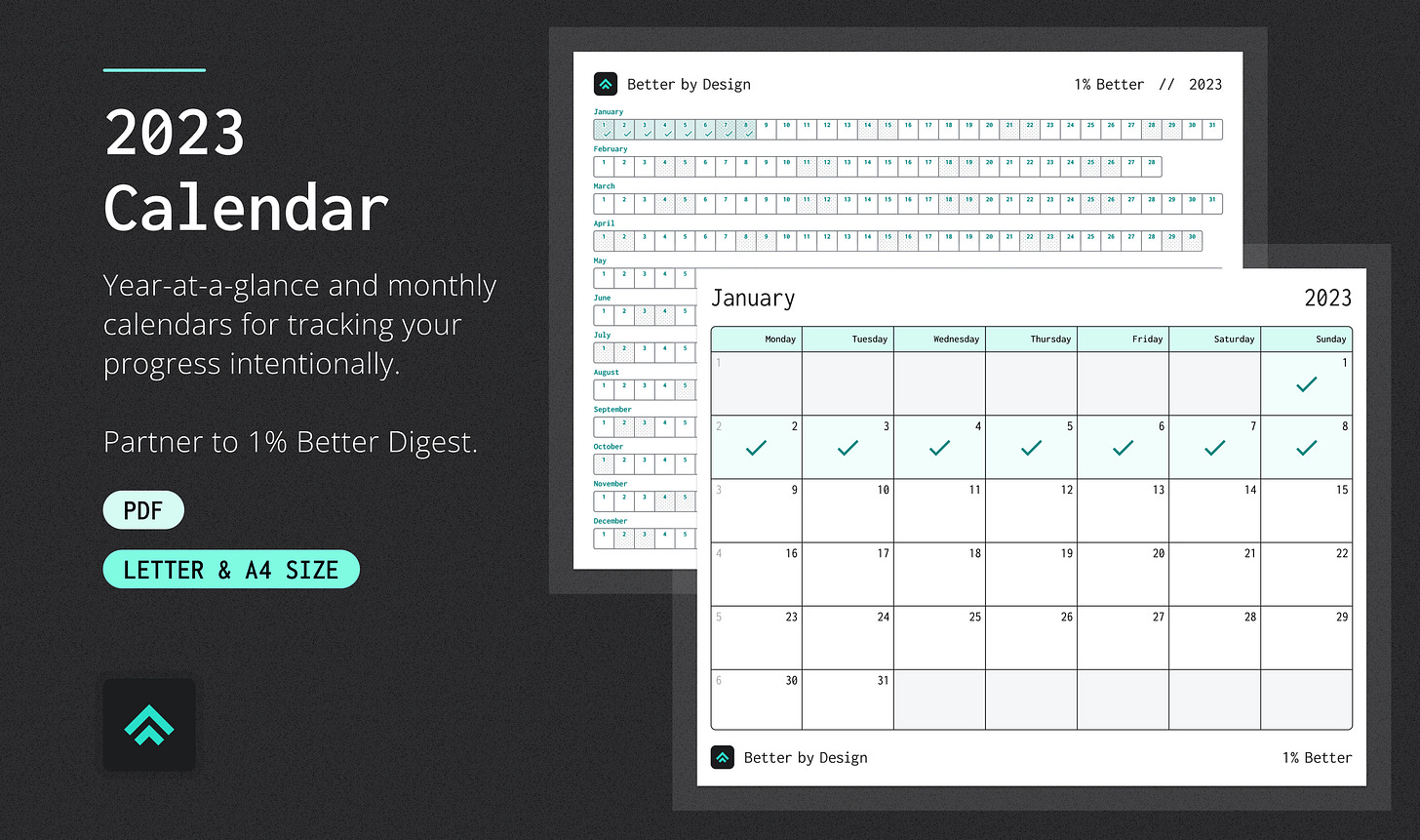
This week I also created a supporting resource for you all: a simple habit-tracking calendar for 2023. It includes both a year-at-a-glance view as well as standard month-by-month views. It’s meant to be a companion to help you execute the self-improvement strategy I write about in the Craft section of today’s digest. It’s free! So no excuses not to get started tracking your progress right away!
Live long and design better! 🖖
Pat
Monday – Social & Behavioral Science
Wu Wei
Wu wei is a concept in Chinese philosophy that is often translated as "non-doing", but I like Alan Watts’ description of it as "acting without force".
It refers to the idea that we should allow natural events to unfold without trying to control them. This is based on the belief that the universe has its own inherent order and that trying to interfere with this natural order can lead to conflict and frustration. The goal of wu wei is to find a state of balance and harmony with the natural world and to let go of the ego's need to control or dominate.
In practice, wu wei involves accepting things as they are and taking action in a natural and spontaneous way, rather than trying to force outcomes or impose one's will on the world. Within creative disciplines, I think you can often see a level of wu wei on display when a master of a craft is performing at the peak of their powers.
Further exploration:
Tuesday – Design Principles
Gestalt Principle: Similarity
Gestalt principles describe how the human brain organizes visual elements into groups or wholes when perceiving the world around us. They're particularly useful when critiquing the implementation of visual design because they can guide us to create more cohesive, intuitive, and pleasing compositions while avoiding choices that might pull our audience's attention in unintended directions.
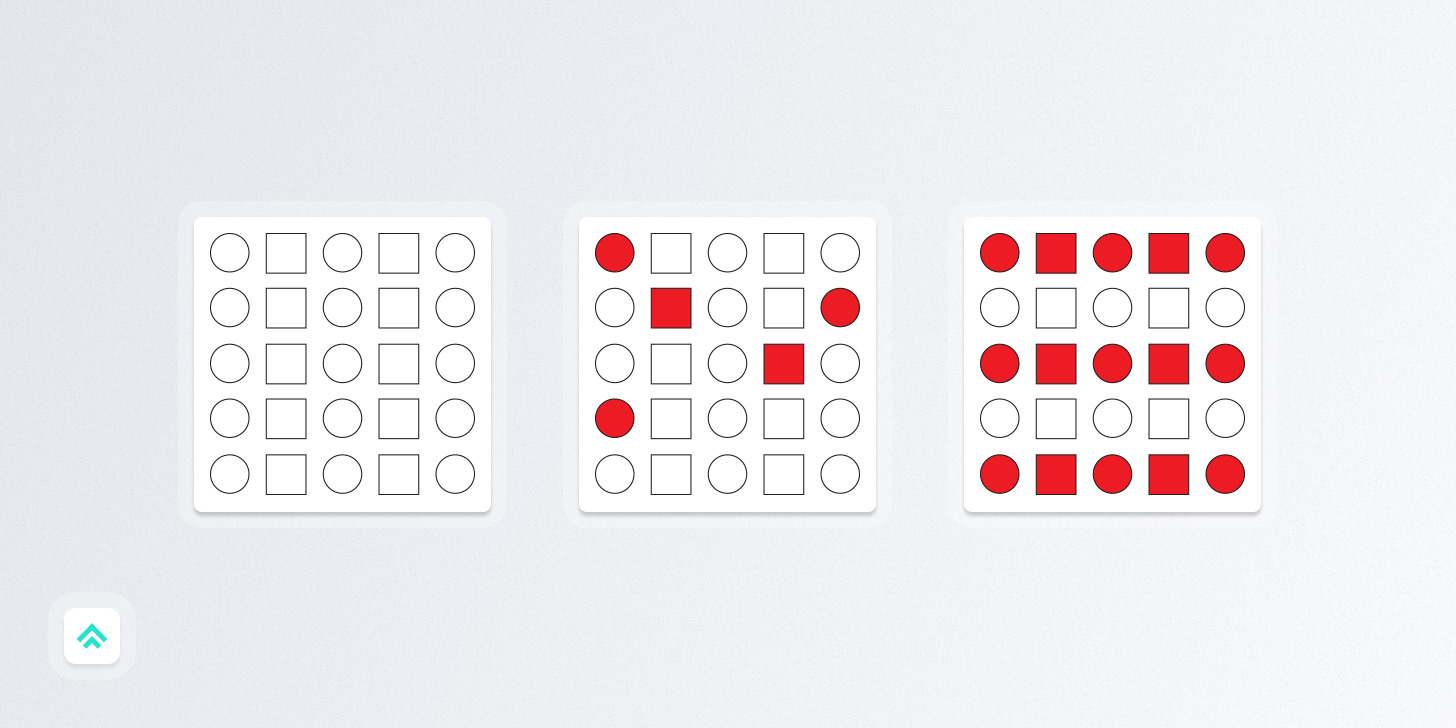
Today's principle, Similarity, dictates that we perceive objects that are similar in size, shape, and color as related to one another. This holds regardless of how close or far apart the objects are in proximity. Multiple similarities can be stacked, with some types (like color) pulling a larger amount of focus.

So, for instance, in the example above:
In the left image, we distinguish by the similarity of shape (circles vs. squares).
In the middle image, the added similarity of color pulls more of our focus. The similarity of shape is still noticeable, though less so than in the first image.
And finally, in the right image, the similarity of color across entire rows now draws almost all the focus, outweighing the original columns visually distinguished by shape.
Further exploration:
Wednesday – Strategy
“What is the problem we're trying to solve?”
Let’s extend last week’s strategy topic of the Single Most Important Thing with a focus directly on designing products.
While high-functioning teams are usually very diligent about defining and articulating the problem they’re trying to solve, it’s definitely not a given. In my experience this often boils down to company culture and whether or not the leadership is fostering communication that’s routinely grounded in problems to be solved.
What I find both cool and powerful about the simple question “what problem are we trying to solve?”, is that by simply asking it you encourage better product and design thinking from whoever has to answer. Compared to starting a project by asking "what requirements are we trying to meet?", “what problem are we trying to solve?” creates a couple of significant shifts:
It puts the focus on solving a customer pain point (even if that 'customer' is a coworker that will rely on your work).
It reduces the risk that you create a good solution that solves the wrong problem (and thus doesn't create the intended impact).
It limits the tendency to over-design or over-engineer (which often occurs when you're unclear on the problem and the scope of change needed to solve it).
Give it a shot. I think you'll be surprised by the impact.
Thursday – Execution
Color Basics: Theory & Harmonies
Color is maybe the most foundational visual building block in all of design and yet most people have no clue how to use it intentionally. I know that color can seem overwhelming to non-designers but it doesn't have to be crazy. Knowing the basics and avoiding common mistakes will take you a long way.
The first thing we need to do when starting a new design is to figure out how to go from “any color” to “a few colors” that are focused and manageable.
The main tools designers employ to focus our use of color are collectively known as "Color Theory". These tools outline practical ways to find colors that look good together via a combo of art and science. If you don’t buy the “science” side just yet, you'll be glad to know that a lot of color theory is based around the "Color Wheel", which was invented by none other than Sir Isaac Newton himself.
When you're starting a new project, you're most likely gonna want to find some colors that look good together (“uhh.. duh, Pat…” 🥲). Designers call these colors that look good together "Color Harmonies". You can think of color harmonies a little bit like musical chord progressions: there are a number of different versions, but just like how a few common progressions power most of pop music, a few common color harmonies make up the lion's share of modern brands.

Common color harmonies
Monochromatic
Uses shades, tones, and tints of one base color
Complementary
Uses colors that are on opposite sides of the wheel
Analogous
Uses colors that are side by side on the wheel
Triadic
Uses three colors that are evenly spaced on the wheel
Further exploration:
Friday – Technology
HSL Colors
You might have noticed that the Better by Design brand uses a monochromatic color palette. Luckily, there’s a color selection model that lends itself well to building monochromatic palettes.
Unlike the more common RGB color model which picks a color by combining red, green, and blue values, HSL picks a color by combining hue, saturation, and lightness (also called luminance) values.
Hue
A degree on the color wheel from 0 to 360. 0 is red, 120 is green, 240 is blue.
Saturation
A percentage value; 0% means a shade of gray and 100% is the full color.
Lightness (Luminance)
A percentage; 0% is black, 100% is white.
Since lightness effectively just modulates the amount of white or black in a color, HSL makes it very easy to find harmonious, monochromatic colors that build off your core.
Further exploration:
Saturday – Career
A good career path doesn't have to be linear
A good, creative career path isn't necessarily (or even usually) a linear one.
It's one where you continue to ask yourself about what you like doing and what you don't like doing and then take action to grab opportunities that improve that balance.
That kind of messy questioning and exploration doesn't show up on the neatly curated timelines of LinkedIn, and the evolutions don't happen as fast as you'd like them to (at least not for me), but they’re ultimately what reveals the right next step.
So take a moment to reflect and write down a response to these short questions:
What do I like about my work right now? How might I do more of that?
What don't I like about my work right now? How might I do less of that?
Then, all that’s left to do is to take a starter action to point yourself in the direction of doing more of the things you like and less of the things you dislike.
Further exploration:
Sunday – Craft
The “Seinfeld Strategy”
The "Seinfeld Strategy" is a productivity technique that involves setting a daily goal and then marking off each day on a calendar as the goal is achieved. The technique is named after comedian Jerry Seinfeld, who reportedly used it to help him develop his writing habit.
The strategy focuses on creating a chain of consecutive days of achieving the goal, with the aim of building momentum and making it easier to maintain the habit over time. The hope is that the small wins and daily progress you make by consistently achieving the goal will help to build confidence and motivation, making it more likely that the habit will stick. The tricky part, as Atomic Habits author James Clear notes, is that the goal you choose "must be meaningful enough to make a difference but simple enough that you can do it every day".
The 1% Better Digest was partly inspired by my own success following the Seinfeld Strategy to improve in multiple areas of my life, from design to music to endurance athletics. My goal with 1% Better is to make improving your design skill set dead simple: just open the newsletter for a couple of minutes per day and then check that box on your calendar! Don't break the chain! ⛓️
I even made you a special, free calendar to remove as much friction from getting started as possible 😎 Don’t forget to download it from my Gumroad store!
Further exploration
If you got a little value in this post, consider subscribing, sharing, or following me on Twitter. If you got a lot of value I’d appreciate it if you bought me a coffee 😎☕️.


I’m loving the 1% Better stuff Pat! I would love to know your method for gathering your daily topics to write about. 😊