“Only when the design fails does it draw attention to itself; when it succeeds, it's invisible.”
Intro
Hello all! I’m back this week with another digest for you. My goal of running a digest every week in addition to my other articles proved to be too ambitious for now, so I’m going to continue to experiment with the cadence as we move forward. Thanks for sticking with me! I have more planned for Twitter again as a companion to the newsletter, so if you’re interested, you can follow me there too: @itspatmorgan.
Live long and design better 🖖
Pat
Social & Behavioral Science
Divergent and convergent thinking
Broadly speaking, design methods are tactics to structure thinking and help facilitate the creative process to increase the odds that the output is both coherent and meaningful. A cornerstone of many of those methods is the idea that there are two major modes of thinking, divergent and convergent, and that it's important to be intentional about when you're tapping into one versus the other.
When you're thinking divergently, you're focusing on generating ideas. The single most important thing is to come up with as many bits of information as possible. It doesn't matter if you think they're smart or dumb, relevant or irrelevant; Don't think, just generate.
Once you've generated many ideas, you can shift your thinking to become convergent.
When you're thinking convergently, you're looking at the information you've accumulated, teasing out patterns, and trying to hone in on a select few most relevant bits.
Teams without design training often struggle to make sense of their ideas because they lack the expertise to intentionally modulate divergent and convergent thinking within groups and then structure their creative output for consistent impact.
Further exploration:
Design Principles
NN/g heuristic #1: visibility of system status
“The design should always keep users informed about what is going on, through appropriate feedback within a reasonable amount of time.”
Nielsen Norman Group's Usability Heuristics are useful tools for people who build software products. The first heuristic, "visibility of system status", is a critical foundation for good software design.
Software products exist across a spectrum of states: success, error, loading, disabled, etc... The better the software is at communicating its current state the better the user will be able to understand how to interact with it.
Failing to communicate system status results in a lot of confusion and frustration. Have you perhaps used an app that neglected to indicate it was loading? Or maybe you've used one that didn't confirm success after an important interaction? They're very frustrating details that quickly degrade a user's experience.
Communicate your state!
Further exploration:
Strategy
“Fire” your bad customers
Designers spend so much time asking "what does the customer really want?" that it can be easy for us to overlook another important question: "do the customer's wants align with what we're willing to provide?"
If you've ever done freelance work you know that some clients are great to work with while others will make you fall to pieces. The same goes for building product-oriented businesses: some customers will help you elevate the value of the product, while others will restrict your ability to do so.
There’s plenty to consider before firing a bad customer, but what I want to stress here is to simply remind you that you have a choice. "The customer is always right" is a well-intended aphorism, but it's not a law of nature.
So yes, focus on adding value for your customers via the service you deliver. But also make sure that each of them is adding enough value for you to continue to deliver great service to others. Because while not focusing on customer needs is one way to put yourself out of business, neglecting your own needs will eventually get you there just the same.
Further exploration:
The 11 rules of highly profitable companies - Tim Ferris
Execution
Typography is the backbone of content on the web.
No matter if you're designing a big splashy marketing site, a sprawling data-dense web app, or a simple personal blog, the typography you choose will make an outsized impact on the design.
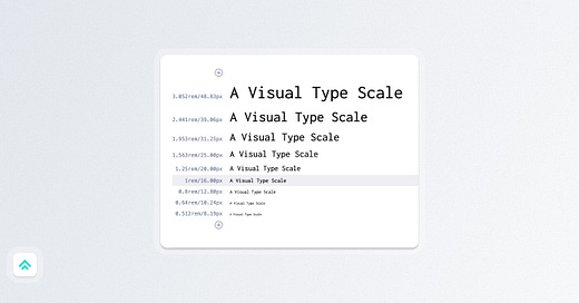
Type scales are a great way to turn your type styles into a type system and thanks to a number of online tools they're now quite accessible for any project.
Like color harmonies, there are a number of common scales that make up the bulk of web applications. In this case, the names of these scales sound a lot like musical scales: "Minor Second", "Major Third", etc...
The most obvious thing you alter by changing scales is the contrast between the steps in the scale. Some will result in minor differences in size between steps, while others will create large discrepancies. Generally speaking, scales with high contrast between steps tend to be better suited to situations with low data density, while those with low contrast tend to be better suited to those with high data density.
The best way I've found to get a sense of type scales is to play around with a tool like type-scale.com so that I can visually see the impact of any given scale.
Give it a shot and consider how you might adjust the scale of a project you're working on to better match the content.
Further exploration:
Technology
HTML headings
Let's quickly talk about Headings in HTML.
Headings make up a good chunk of the Type Scales we just talked about.
There are six official levels of headings as defined in the HTML spec: H1, H2, H3, H4, H5, and H6. You may not need to use all six (in fact, I seldom do), but that's what's officially available to you.
Headings are a critical part of the “Flow Content” HTML Content Category because they help section your content for both the users who read it and the other technologies that parse it.
Three particularly important reasons to dial in your use of headings:
They specify the level of importance of the content (H1 being most important and H6 being least important)
Search engines use them to index your pages and understand your document's structure
Screen readers often use them to navigate the page for accessibility
PS. Note that these are Headings, not Headers. A header is a different element 😇
Further exploration:
Career
Skill mapping
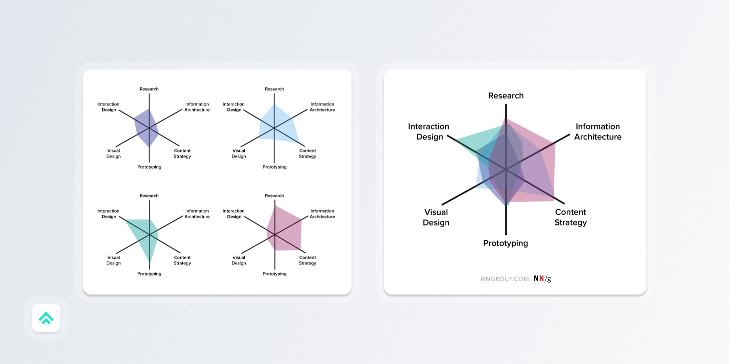
Skill maps use a radar chart to help understand the overall coverage of critical skills possessed by an individual or a team.
In my experience, they're more useful for considering the development of a team.
Modern product design is such a massive combination of disciplines that it's impossible for one person to be an expert in all of them. This makes it that much more important to consider building a team with complementary skill sets that overlap.
For instance, the growth of a previous team of mine:
Started with two generalist product designers, with relative strengths in UX and interaction design
Then added a design technologist to build the technical and prototyping skill set
Then added a content strategist to build that domain
And finally, added a visual design specialist to lift the group in that area
We all had our relative strengths and weaknesses, but together our combined skill sets resulted in a powerful team dynamic.
Further exploration:
Craft
In a recent Beatles documentary, there's an incredible moment where you get to watch Paul McCartney stumble upon the core of the song "Get Back". It's a perfect example of how great ideas often appear serendipitously in the flow of continuous creation.
We have a tendency to think that great work only results from maximum effort. But for the most part, you can't force great creative work. The reality is that transcendent pieces often take the same amount of effort (or less!) as any other ordinary piece.
It's not about how much force you're exerting on a given piece, it's about the cumulative effort you've put in to maximize your chance that something miraculous emerges from your ordinary workflow.
Paul McCartney has written thousands of songs in his lifetime and while I bet he labored over some of them, others, like "Get Back", just came to him out of thin air in the ordinary course of doing the work.
The same will likely be true for you.
Further exploration:
If you got a little value from this post, consider subscribing, sharing, or following me on Twitter. If you got a lot of value I’d appreciate it if you bought me a coffee 😎☕️.


NN heuristics - that brings me back! The system status one is probably my favorite. Heuristic evaluations were part of why I pivoted my career from user research to design/engineering. It seemed like you can get 90% of the way to a great UX by just making sure your design adheres to the heuristics. I haven't done a heuristic eval in years, I really should though!