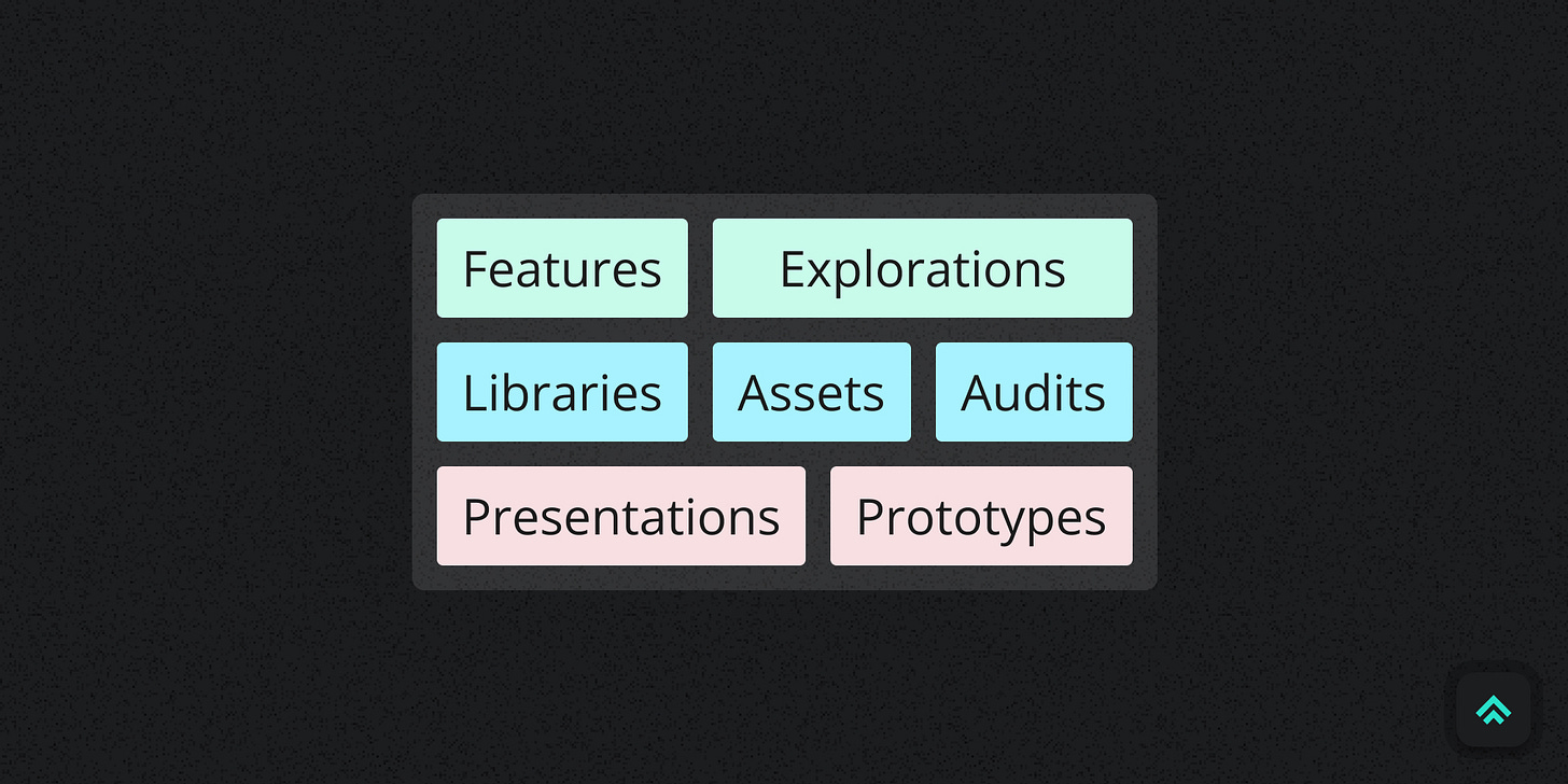
1 Figma file type, 7 types of work
How I bring more clarity and intention to my Figma design files
Hey friends 👋
Welcome back! If you’re new here my name is Pat. I’m a principal product designer in tech and in this newsletter I explore tactics and strategies from my decade in the business to help you elevate your craft and make what you’re making better... by design.
A number of folks have asked about how I manage work within my Figma files, so today we’re gonna look at how I structure my common design artifacts within Figma’s standard ‘Design’ file type (FigJam will have to wait for another day 🥲).
I’ll likely do deep dives into a couple of these in the future, but for today let’s keep it simple and start with an overview. Let’s go!
As a product designer I create many kinds of design artifacts depending on what I’m trying to communicate. I used to distribute this work across multiple apps but over time I’ve found it simpler to consolidate mostly into Figma.
With only one official file type but many types of deliverable work, it’s easy for the files in your Figma account to become one big, jumbled mess. To avoid that, I took some time to get clear on the intent of each of my files to make sure they were structured appropriately for their purpose and set up well to maintain over time.
I found my Files tend to fall into one of three groups:
Feature-like
Files with designs that are meant to directly influence the development of some feature set in the application as well as explorations that may or may not end up going anywhere.
Library-like
Files that contain shared resources meant to support the team over time. This obviously includes official Figma libraries, but also extends to other shared assets that wouldn’t benefit from being an official library.
Presentation-like
Files that are structured specifically to facilitate presentations or demos. For me, that includes both slide decks and prototypes.
Feature-like
Features
Feature design files are by far my most common. It’s where I capture the output of a double-diamond-ish design process and ultimately deliver workflows to dev. They expand or contract according to the size and complexity of the functionality and capture everything needed to get that dev work shipped.
One confusing terminology thing here is that I would usually call this kind of product delivery work a design ‘project’ but that conflicts with Figma’s naming convention of a ‘Project’ as a container for multiple design ‘Files’. I never hand off a Figma ‘Project’ (multiple grouped files) for a single design & dev project. I contain the scope of the feature within one Figma file and break out its segments onto pages within it. Since you can share links to pages (or individual Frames) just as easily as links to files I’ve found it more useful to keep a single scope of design feature work within one file.
The example above includes both the file thumbnail, which shows that the file is a feature alongside its name, a short description and its current status. Then inside the file I use plenty of pages to separate out a roughly reverse-chronological snapshot of the design process with final designs to implement at the top, an archive at the bottom and everything else in between.
Explorations
Explorations are just blank space for divergent thinking. They might evolve into something we implement, but not necessarily.
I do try to organize as I go and end up in a place where any File I’m handing off is as clear and communicative as possible. But when I’m just getting going I don’t let any of that bog me down. I try to keep the simple stuff simple and let explorations take whatever shape helps me get the idea out of my head.
You can see in the example I didn’t bother with a file cover or any other convention for this quickie exploration. I just wanted to get the idea out. Nothing directly came of this one but it did influence some other subsequent work.
Library-like
Libraries
At JupiterOne, our official Figma libraries exist to house the shared components and styles that the team relies on to power many of our designs. They have a unique purpose and so they merit distinct organization and management. For instance, a simple way I distinguish them in our account is to use an alternate dark theme thumbnail (as opposed to the light theme used for all other files).
If the library has a code-based counterpart, I strongly prefer a page-separated file structure where I limit each page to displaying one main component. This usually aligns better with how the code is structured in its repository and in my opinion it makes it easier to track the connection from the design side to the dev side (and vice versa). Separating by page also gives me more space to add documentation around each component without cluttering any one view.
The only downside I’ve felt using this structure is that I can’t wrap my components in Frames within each page for further organization without adding unnecessary nesting in Figma’s asset browsing panel. The workaround I use is to keep a documentation page component in my separate Figma Helpers library which I use as a backdrop for component documentation. An instance of that component gives the visual appearance of putting stuff in a Frame without actually doing it, leaving my asset browser nesting intact.
If the library doesn’t have a code-based counterpart I just do what I think will make it most consumable for the other designers who need to use it. I still usually page separate components, but I’m more flexible with it.
Assets
I use the term ‘Assets’ to describe basically any resource intended to be shared, reused and iterated on over time. Collections of things like slide deck templates, Zoom backgrounds, brand elements, persona cards, etc...
Structurally I don’t do anything too special with them besides clearly call them out as Assets on their thumbnail. The files are often simple and to the point anyway so no need to complicate them.
The example is some basic Zoom backgrounds we made for our team. The main thing to note is that library-like files get the status ‘Healthy’ rather than ‘Done’. This is because it’s an Asset we intend to maintain over time. So it’s never truly done, it’s just done for now… until we decide to update it.
Audits
I think of Audits as a special research-focused asset that can also merit library-like treatment depending on the circumstances.
I often do audits as part of research for a feature so they could easily exist only in that context. But after finding that I’d regularly end up wanting to reference an audit again for other work I decided to start tracking important ones separately (things like major patterns or competitors). This helped me to build an easily accessible, shared base of comparative research for myself and the broader team.
The example is a competitive audit, so the pages are separated by competitor and date, with our closest competitors at the top. Again, since it’s a library-like file it gets the status ‘Healthy’ rather than ‘Done’.
Presentation-like
Presentations
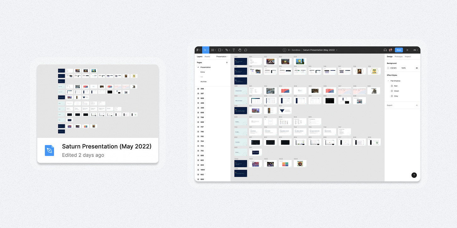
I don’t make a lot of presentations in Figma, but when I do they’re structured in their own unique way to make the most out of Figma’s presentation mode.
Presentation mode cycles through your Frames from left-to-right, then top-to-bottom so it’s important to outline your flow to fit that order. This feels natural to me as it’s how I used to literally build slide decks with print-outs on an office wall during my advertising days.
I don’t manually name individual Frames in presentations. I think it’s a waste of time. Instead, I use the rename function of a plugin called ‘Super Tidy’ to get every Frame named correctly according to its position on the canvas. Because I frequently add, remove or swap positions of slides, being able to automate renaming to ensure a properly ordered presentation has been a lifesaver. A big thank you to Ismael González for building that plugin for the community 🙏.
I haven’t made many library assets for presentations, but I did make some very basic slide templates for section headers. You can see them in the example in the far left column of slides.
Update: If you want to know more about how I approach presentations, see my follow-up post: “How I use Figma to craft better presentations”
Prototypes
Finally, there are a lot of examples on the internet of super sophisticated Figma prototypes with connections going every which way and all sorts of pieces flying in different directions. This is… not my approach.
To be honest I don’t currently have much detailed prototyping bandwidth so the prototypes I do make tend to be simple; just enough to communicate the idea I need to get across to the team.
So, with that in mind, I structure them as if they were a presentation with superpowers. That means I lean back into the left-to-right, top-to-bottom presentation structure then add a bunch of prototype links. It’s not perfect, but it gets the job done for me right now as I have to optimize for simplicity and efficiency. It also means that even before I add prototype links I’m able to tap through the flow to get a sense of which interaction states I might be missing.
In the example, you can see that by structuring the prototype as a ‘presentation with super powers’ it’s easy to distinguish interaction flows from top to bottom.
Similar posts
If you got a little value in this post, consider subscribing, sharing, or following me on Twitter. If you got a lot of value I’d appreciate it if you bought me a coffee 😎☕️.


Great post with some very useful tips! I never thought about Presentations and Prototypes being the same kind of file/approach, but you're absolutely right.
I've noticed too that Figma's projects are kind of misnamed, as least based on the usage I've seen. I don't think I've ever seen a project split across multiple files.
For small to medium size projects I often go a step further and stay within a single Figma page and use giant font size headings and horizontal lines to break things up. That way people can just zoom in and out and scroll to view different design variations and states within a feature. And it's easy to get a birds eye view of everything at once. For final handoffs, I'll clean up that page so engineers know that if it's in the file, it's in scope (or I'll use some visual way to mark related designs in the same file as out of scope).