5 Proven Sets of Design Principles and How I Use Them
Tried and true guidelines for crafting great quality, high impact designs
Welcome to Unknown Arts, where builders navigate AI's new possibilities. Ready to explore uncharted territory? Join the journey!
Intro
Articulating why a design is good is always a challenge.
Even the veterans sometimes struggle to find the words!
Luckily, there are a number of common sets of design principles that provide practical starting points for analyzing designs and expressing what’s successful or unsuccessful about them.
While senior designers tend to internalize these principles through years of practice, for everyone else, it’s helpful to have a quick reference you can open up when it’s time to review. This post is meant to provide that reference.
It’s important to note that design principles are not immutable laws of nature; they’re rules of thumb that tend to result in better work.
Think of them as suggestions from a trusted mentor: you should probably take their advice, at least until you’re very confident in your own skills and experience.
The following five sets of principles are the ones I’ve turned to the most in my decade of creating digital products. They aren’t a silver bullet for every scenario you’ll face, but they’re tried and true and have been useful for me.
I hope you find them useful too.
Until next time,
Patrick

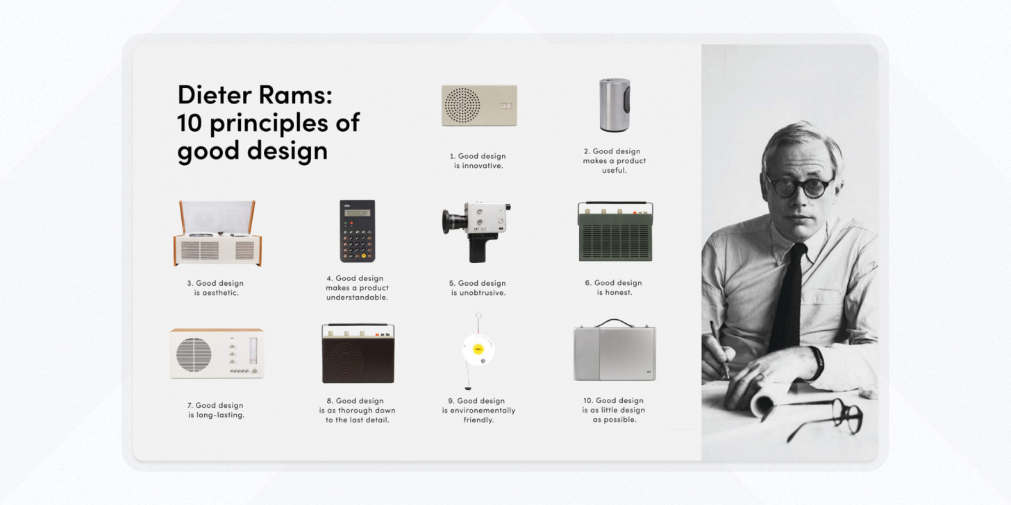
1. Dieter Rams’ 10 principles for good design
Overview
Industrial designer Dieter Rams was concerned about the poorly designed and unnecessary products that he saw on the rise during the latter half of the 20th century. By capturing his 10 principles, Rams aimed to offer clear guidelines that designers could follow to make their work more effective, responsible, and enduring.
How I use them
Rams’ principles are great for discussing why a design works or doesn’t work at a high level.
I find them particularly useful for making product design analysis approachable for anyone in business (which is why I use them routinely in my articles! 😇).
Few products nail every principle, but if you let one lead the way and build up a couple of others as support, you’re likely headed toward a good design.
The principles
Good design is innovative
Good design makes a product useful
Good design is aesthetic
Good design makes a product understandable
Good design is unobtrusive
Good design is honest
Good design is long-lasting
Good design is thorough down to the last detail
Good design is environmentally friendly
Good design is as little design as possible
Resources
Article → "Dieter Rams: Ten Principles for Good Design" - Vitsoe
Better by Design articles highlighting aspects of each principle:
Principle 1 → Anglepoise lamp
Principle 2 → Dyson cordless vacuum
Principle 3 → Eames shell chair
Principle 4 → Vitamix blender
Principle 5 → Motorola Razr v3
Principle 6 → Converse All-Stars
Principle 7 → The gooseneck kettle
Principle 8 → Stardew Valley
Principle 9 → Dr. Bronner’s soaps
Principle 10 → The pedestal collection

2. Nielsen-Norman usability heuristics
Overview
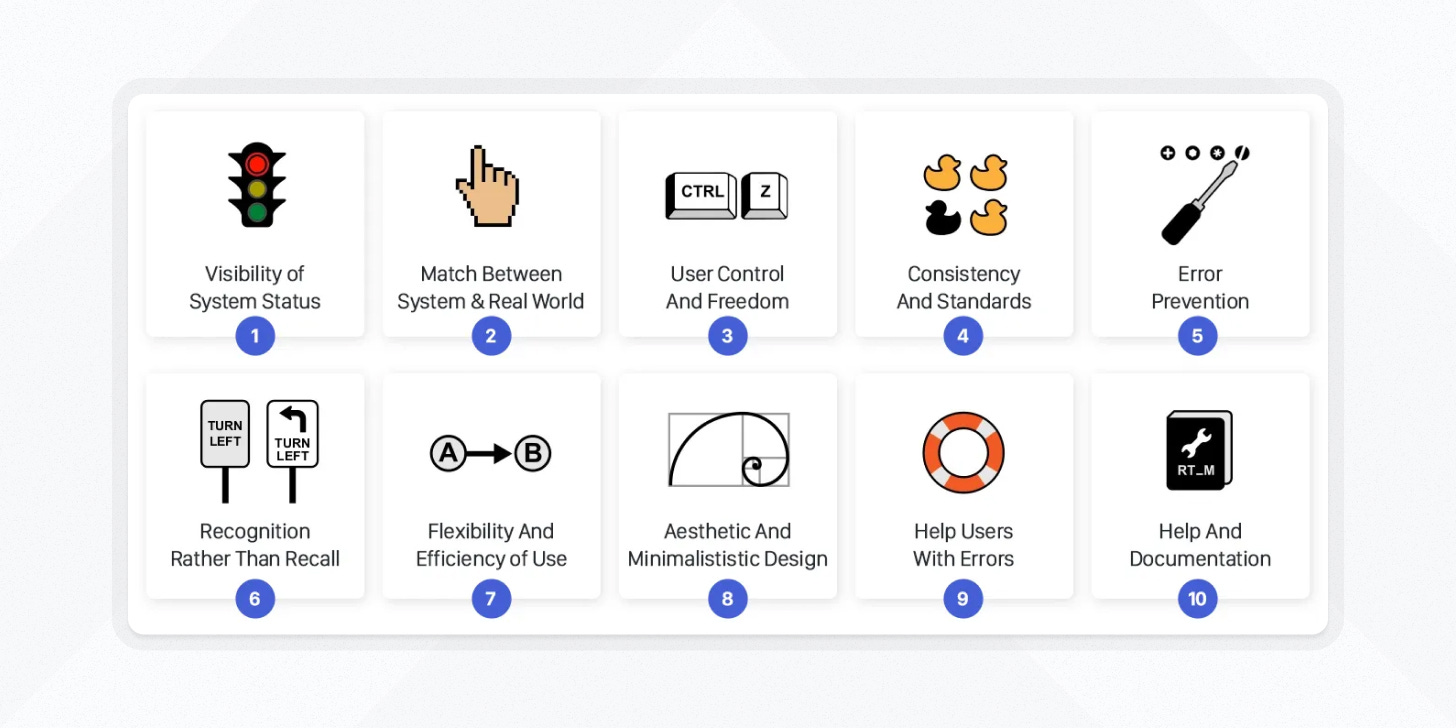
Rooted in decades of user experience research, the Nielsen-Norman heuristics offer a good reference for creating intuitive and user-friendly digital interfaces.
How I use them
I use the Nielsen-Norman heuristics as a first line of defense for sticking the landing with interface usability.
When I’m new to a product it can be helpful to use them as a foundation for auditing how the experience might be improved.
I also find them useful for guiding software engineers toward making smarter user experience decisions even in the absence of much direct design support.
Ultimately, if your software holds up well against these heuristics, you’re probably doing pretty well for yourself.
The principles
Visibility of system status
Match between the system and the real world
User control and freedom
Consistency and standards
Error prevention
Recognition rather than recall
Flexibility and efficiency of use
Aesthetic and minimalist design
Help users recognize, diagnose, and recover from errors
Help and documentation
Resources
Article → How to Conduct a Heuristic Evaluation
Examples of the 10 usability heuristics applied to…

3. W3C accessibility principles
Overview
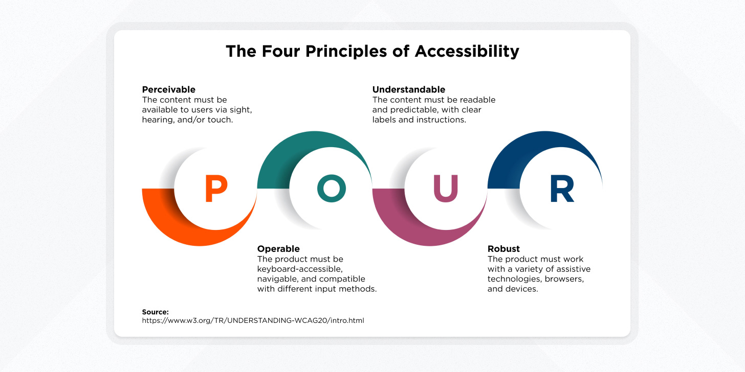
A cornerstone of inclusive design, the W3C accessibility principles emphasize the importance of creating digital products that work for every user, regardless of ability or impairment.
How I use them
I find the W3C principles to be most useful when I’m trying to communicate tangible reasons why to prefer one design execution over another.
Particularly in environments where I’m either the only designer or one of few, being able to tie visual design executions to compliance standards gives me more support to back up design choices that may otherwise be seen as purely qualitative.
The principles
Perceivable: Information and user interface components must be presented in ways all users can perceive.
Operable: Users must be able to interact and navigate easily.
Understandable: Information and the operation of the user interface must be clear.
Robust: Content must be robust enough to be interpreted by a wide variety of user agents, including assistive technologies.
Resources
Docs → W3C Principles Official Docs

4. Gestalt principles
Overview
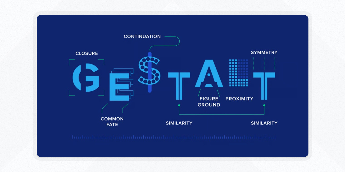
Delving into the psychology of perception, the Gestalt principles help designers understand how humans interpret visual information, ensuring that digital interfaces align with innate cognitive patterns.
How I use them
I reference Gestalt principles when I need to get specific about visual design.
By aligning my work with natural human perception, Gestalt principles help me to make interfaces that are more intuitive and approachable. They give me clear levers I can pull to guide my audience’s focus.
These are the most scientific and objective of the principles included in this post, so they’re worth a little extra attention.
The principles
Proximity: Objects close to each other are perceived as a group.
Similarity: Similar objects are often seen as a group.
Continuity: The eye is drawn to continuous lines and shapes.
Closure: We tend to see complete figures even when part of the information is missing.
Figure-ground: We distinguish between a figure (object of focus) and its surrounding background.
Common Fate: Elements moving in the same direction or displaying similar motion are perceived to be more related than those that are stationary or move in different directions.
Symmetry & Order: People will perceive and interpret ambiguous or complex images in the simplest form possible.
Resources
Article → Improve Your Designs With The Principles Of Similarity And Proximity
Article → Improve Your Designs With The Principles Of Closure And Figure-Ground

5. Tenets of Humane Technology
Overview
The Center for Humane Technology’s tenets are an important new set of guidelines for modern product creators.
They push technologists to think beyond engagement metrics and prioritize genuine human well-being.
They leave behind the era of “move fast and break things”, ushering in a future where technology works with, rather than against, our human nature.
How I use them
I use these principles as a guide for considering the ethical impact of choices I make when creating new technologies. They may be lofty, but they’re worth striving for.
The principles
Respect human nature: ”How can technology work with, rather than against, our innate vulnerabilities and biases?”
Minimize harmful externalities: “How do economic forces affect products, and how can product teams reduce harmful side effects?”
Center on values: “How do the conditions of our lives shape our values and how might metric-driven product development be centered on our values?”
Create shared understanding: “How can technology foster the trust and understanding we need to solve complex problems together?”
Support fairness and justice: “How can technology enable a more just world, and integrate the voices of people who experience harm?”
Help people thrive: “How can products help people act in alignment with their deeper intentions, rather than optimizing for engagement?”
Resources
Website → Center for Humane Technology
Course → Humane Tech Course
Video → The Social Dilemma
Person → Tristan Harris
Interested in working together? Check out my portfolio.
Find this valuable?
Share it with a friend or follow me for more insights on X, Bluesky, & LinkedIn .


