Hello, everyone! 👋
It’s been a minute.
I missed last week because… well… I was traveling and got lazy.
It’s so easy to think “oh I can skip one day!”, but inevitably you end up skipping more after giving yourself that permission once. The irony of course is that the work the next time after a skip is harder than it would have been to just stay the course…
In any case, we’re back in action now with a little gratitude inspired by my week in Brooklyn.
Design gratitude 🙏
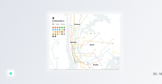
This week I’m grateful for Work & Co’s digital interpretation of the NYC Subway Map.
To understand why we need to take a little trip down subway history lane.
Despite living in NYC for 3 years in my mid-20s, I never learned much about the rich history of its subway system. There’s a ton of interesting stuff to dig into, but from a modern design perspective, there are two case studies that stand out.
The first is the unification of subway signage across the system by legendary designer Massimo Vignelli (definitely worth looking into. Helvetica ftw!).
And the second, which is my focus today, is a debate about how to best represent the city’s sprawling subway system on a map.
After updating the signage, Vignelli also got the chance to rework the map which he drastically simplified and abstracted in the tradition of Harry Beck’s influential and well-received design for the London Underground. He removed the streets, ditched the blue water, and even changed the shape of Central Park (it’s narrower and longer than represented). He optimized the design to make it easy to navigate the system relative to itself; to understand the train lines and stops with no distractions from the quirks of the geography above ground.
Effectively, Vignelli took what had been a literal map of the terrain with transit overlayed and stripped it back until all that was left was a diagram of the transit itself. However, while this might have been a good design idea it proved to be too much of a departure for many New Yorkers and was received poorly. As John Tauranac put it at a 1978 debate:
“Mr. Vignelli’s map, which everyone can see is an aesthetically pleasing map. And it’s made some lovely T-shirts for us at the MTA. But there is no relationship between the subway routes on this map and the city above.”
The map excelled in form but came up short in function for the people it was intended to serve and since the new map proved harder to use in practice, the MTA eventually returned to a more geographically true version that persists to this day.
This brings me back to what I’m actually grateful for today: Work & Co’s digital interpretation of this Subway Map.
In reality, I think that both of the classic map designs have their merits. The geographic features have helped me navigate the city many times but occasionally, a simple diagram would have been enough. It’s contextual.
By building a web experience for the map, Work & Co was able to capture some of the best elements of both mapping approaches:
At a high level (zoomed out), they were able to represent Vignelli’s diagram-esque take on understanding the transit system.
At a low level (zoomed in), they were able to match that transit to the actual geography of NYC.
While in 1978 the city had to host a literal, in-person debate to pick only one approach, now we have the magic of web technology to enable experiences that tap into the strengths of both.
Pretty cool.
Creator of the week 🧑🎨
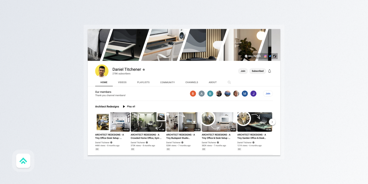
Daniel Titchener - Architect & YouTuber
Daniel burst onto the scene two years ago with his smart videos combining his training as an architect with his interest in minimal living. His design breakdowns are really approachable and his aesthetic instincts are top-notch.
Lots to be learned on his channel!
A magazine for the design inclined
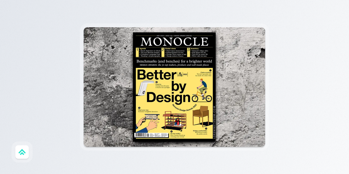
I recently had coffee with a friend who likes design but didn’t know about the goodness that is Monocle Magazine.
Monocle calls itself an outlet “to provide a briefing on global affairs, business, culture, design and much more”, and I’d say odds are if you like my little newsletter you will love their expertly crafted magazine.
Their content is strong across the board, but the monthly physical magazine is a real delight. It’s been a treat each and every time it’s shown up in my mailbox. 🤌
A tool I’ve been enjoying 🛠
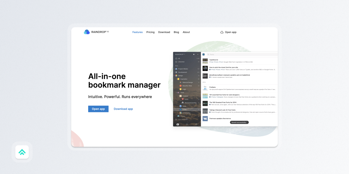
Raindrop.io - A very nice bookmark manager
Raindrop is a new riff on a theme that’s been played for a while by apps like Pocket and Instapaper. It’s a nicely designed product with some thoughtful design touches.
Definitely worth a shot if you wanna try a new evolution on the ‘read-later’ genre.
Recently on Design Gratitude 🔙
If you got a little value in this post, consider subscribing, sharing, or following me on Twitter. If you got a lot of value I’d appreciate it if you bought me a coffee 😎☕️.


