Hello designers!
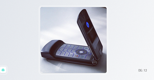
This past week I was visiting family for the Thanksgiving holiday, staying in the house where I grew up. As tends to happen when I’m there, I stumbled upon a relic of my youth that took me way, way back. This time, that relic was my svelte, black, Razr cell phone. So without further ado…
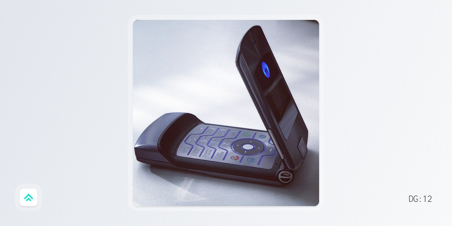
This week I’m grateful for the Motorola Razr v3.
Design gratitude 🙏
Released in 2004, the Razr made a big impact on how we think about mobile phones.
It was the first time I remember thinking a phone was actually stylish and that I desperately had to have one (ya know, to prop up my middle-school clout 😅).
These days I can’t help but think that we owe a big debt of gratitude to the Razr for priming our culture’s appetite for a well-designed handset.
The Razr showed that a mobile phone could transcend from being a simple, tech utility into a fashion piece setting the stage for how smartphones would eventually be adopted. It seeped deep into pop culture by creating special editions with big brands like Dolce and Gabbana and Maria Sharapova (gold and hot pink Razrs, respectively).
Ultimately, the Razr v3 went on to sell over 130 million units, more than doubling the next best flip phone (the Motorola StarTAC from 1996). It was clearly a massive success, but why was it a good design?
Let’s count the ways…
Rams’ Principle #2: It’s aesthetic
In my opinion, the Razr represents the pinnacle of “mobile phone” design before phones became full-fledged pocket computers.
It feels like the most refined version of the flip-phone form factor and combines a number of iconic design elements. From the single-piece metal keypad to the chin bump to the incredibly satisfying feeling and sound of flipping it open and closed, the Razr nailed aesthetics on every level.
Rams’ Principle #5: It’s unobtrusive
Nestled in between the big, analog clunkers of the 90s and the silly, giant phablets of today there existed a brief moment in time when mobile phones were small.
The Razr represented the best of this moment.
It was a super pocketable tool that was ready for you when you needed it and otherwise got out of the way. It was such a success in this regard that close to two decades later Motorola is still trying to recapture some of its magic with a modern version based on folding screen tech.
Designer of the week 🎨
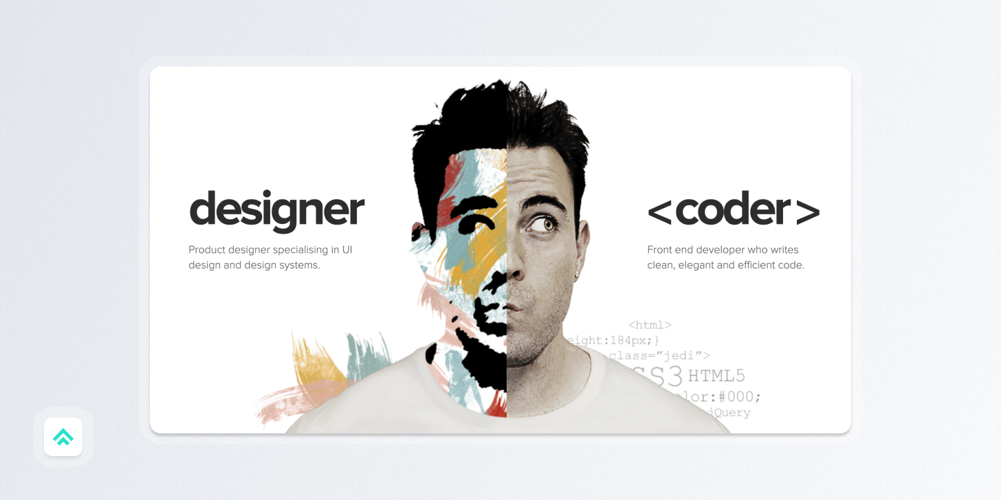
Adham Dannaway - Author of Practical UI
I first came across Adham’s work many years ago when his portfolio blew up on the blogosphere. As a fellow design & dev hybrid, he immediately stood out to me.
Today he’s releasing a super useful new book called Practical UI, which puts together the essentials of what you need to know to design better interfaces. In my experience, a lot of good UI design can be accounted for by simply nailing the basics and avoiding a few common pitfalls.
If you design or build UI, I’d highly recommend following Adham and if you want to support him, buy the book!
A website to check out 🌎
Lover’s Magazine - https://www.loversmagazine.com/
If you’re a design-inclined person, Lover’s Magazine will be right up your alley. I’ve particularly been enjoying their 400+ interviews with designers of many different disciplines: product designers, graphic designers, front-end, and many more.
In their own words:
Lovers Magazine is a diverse and inclusive online community for creative professionals. We exist to empower and amplify the voices of designers who are improving the lives of many by designing the tools, aesthetics, and spaces of the future. We seek answers to essential questions to push and inspire the collective. Lovers Magazine is a peek into what turns the best designers on about their craft and passions.
A video to watch 🎥
Struthless - “I promise this story about fonts is interesting”
Another straight-up banger of a video from designer and YouTuber Cam Walker on his Struthless channel. Clocking in at around 30mins, this piece is more like a mini-documentary so set aside a few minutes and dig in! I can verify that he does indeed live up to his promise to make font history interesting, even if the conclusion is that we should all use more Comic Sans… (JK! Can you imagine?! He does talk about Comic Sans at one point though 😇)
If you got a little value in this post, consider subscribing, sharing, or following me on Twitter. If you got a lot of value I’d appreciate it if you bought me a coffee 😎☕️.


