Design Gratitude 💚
In the spirit of the new year, best intentions, and resolutions I may live to regret, I thought I'd do a little fitness-focused gratitude this week.
Also, I'm expanding the 'designer of the week' concept to include 'honorary designers' as I want to recognize any person who is putting in the effort to bring more good design into the world regardless of whether or not 'design' is in their job title.
Let's get to it!
Product 🛠️
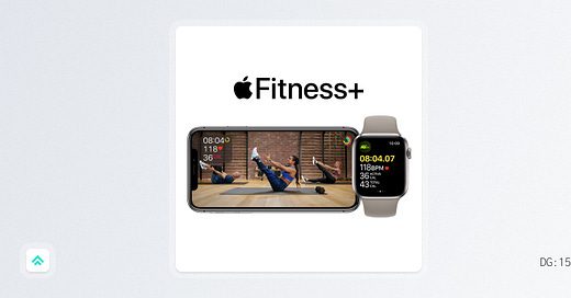
This week I'm grateful for Apple's Fitness+ service.
I admit I was skeptical of Fitness+ upon its release and didn't expect to incorporate it into my regular workout routine. But after trying it for the last few weeks I can report that it's been a useful resource and includes some really nice design touches too.
In the last few years, I've watched the rise and fall of many gimmicky, single-purpose, connected fitness devices. They’d catch my eye, but inevitably fall flat because I couldn't see how they'd add value to my existing workout program; they seemed designed to replace, not supplement. In comparison, Fitness+ works wonderfully as a supplement to my routine.
The main reason I want to highlight Fitness+ today is that I think it represents an excellent blend of software, hardware, media, and design all rolled into one. The sheer number of things that had to come together to enable such a seamless service boggles my mind... But I'm not here to boggle minds, I'm here to talk about why it's a good design. So let's count the ways...
Rams' Principle #1: It's innovative
I know, I know... a fitness content service isn't exactly innovative in and of itself. We've seen plenty of those at this point. But Fitness+ is executing at a really high level in terms of seamlessly integrating hardware, software, and media in a way that augments the impact of each.
For hardware: the experience wouldn't be possible without the innovations that led to the iPhone, Apple Watch, and Airpods as they currently stand.
For software: the seamless yet wireless synchronization between the three devices is no small feat.
For media: the guided layer it adds on top of the hardware and software amplifies your understanding of what you might do with the devices.
It's a rare combination of iterative and compounded innovation that's worth recognizing.
Rams' Principle #2: It makes a product useful
I remember when the first Apple Watch came out I just kinda shrugged; a resounding 'meh'. It didn't seem that useful to this longtime Garmin fan. But boy has that changed over time. As the tech developed, the design improved in tandem and the product got better as a whole. Then the addition of Airpods made the Watch even more useful.
Today, the Fitness+ content library adds even more utility on top of that. This vast library of useful fitness guidance is available to me at any time, right there on my wrist or phone. It's a product that literally makes multiple other products more useful. A prime display of principle #2 in action.
Rams' Principle #8: It's thorough to the last detail
There are so many little things that round out the Fitness+ experience:
The animations that happen when your activity tracking rings close
The way UI elements for new segments of a workout fade in and fade out
The way songs are set to start and finish at precise moments in a spinning class
The list goes on...
It's very, very thorough.
Person 🧑🎨
Today's honorary designer of the week award goes to
.I recently came upon Gordo's work after he appeared on the Rich Roll podcast (one of my faves). He's an endurance athletics legend who's been sharing his insights online for many years. But that's not why I want to recognize him. He gets the nod today because he's been working on updating his online presence, including making the move to Substack.
After seeing his announcement on Twitter, I suggested a few minor adjustments to improve his brand's design consistency. He was very kind about it and followed through with making some updates, so kudos to Gordo for being a good sport and living the Better by Design ethos!
If you're into endurance athletics, check out Gordo's 'Endurance Essentials' newsletter. Or if you're looking to bring more intentionality to your life and finances, give his 'True Wealth' newsletter a shot!
I wanted to highlight this little interaction because the truth is that design happens regardless of whether or not a designer is involved. Ultimately, there's no such thing as 'no design'; the alternative to 'good design' is just 'bad design'. And while it's tempting to shrug off design quality when it's not your official responsibility, just caring about quality goes a long way toward making things better. I believe in helping anyone who's willing to make the small changes that raise the floor for what we generally accept as "good design" and hope you'll join me in that quest. It might not be as sexy as some big, bold new project, but collectively I think the small improvements might be even more powerful.
Moment of Zen 🧘
This video makes me laugh every time I watch it.
It's a mashup of a clip from a Paul McCartney documentary where Paul is listening to the stems of a song with famed music producer Rick Rubin except instead of playing back one of Paul's actual songs they're playing back... All-Star, by Smash Mouth.
It's just so dumb and excellent. An A+ use of the internet.
If you got a little value in this post, consider subscribing, sharing, or following me on Twitter. If you got a lot of value I’d appreciate it if you bought me a coffee 😎☕️.


