GM designers! 👋
I dunno about you, but I think it’s about time for some weekly design gratitude.
I have plenty to be thankful for this week. In particular, there are about 50% more of you reading this week! Wow! So grateful for each and every one of you for giving me a chance and you can bet I’m gonna bring my best to the table for you each week. Early adopters get the VIP treatment! 🍾🎉🥂
My original concept for mid-week Design Gratitude was to use Dieter Rams’ 10 principles to talk about good designs and I haven’t yet paid homage to the man, the myth, the legend. So without further ado…
Design gratitude 🙏
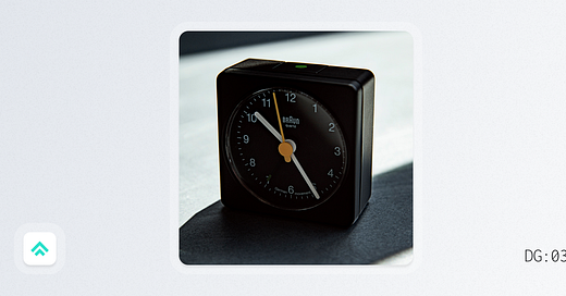
This week I’m grateful for Braun alarm clocks.
There are so many iconic, good designs to feature from Rams’ storied career. While this clock was technically designed by Dietrich Lubs during Rams’ tenure at Braun, I figured I should start with the design that I personally own.
That’s right, I put my money where my mouth is and bought some good design.
The good news is that the modern version of this delightful little clock is very affordable (less than $30 at the time of writing).
So why’s it good? Let’s count the ways.
Principle #3: It’s aesthetic.
Search for ‘alarm clocks’ on Amazon and prepare to shed a tear or two at the general state of design in the space. The Braun clock though? Simple, clean and compact. It’s just a good looking device.
Principle #6: It’s honest
I mean, look. It’s a basic alarm clock. What exactly were you expecting? A design shouldn’t try to be more than it needs to be. It serves its purpose and delivers great results in an aesthetically pleasing package. That’s design honesty.
Principle #7: It’s long-lasting
It’s not connected to Alexa and it won’t wake you up to the sweet sound of ocean waves, but this alarm clock is gonna show up for you whenever, wherever you need to wake up. The original design began in the 1970s and it’s still as solid as ever. A timeless time-piece if I’ve ever seen one.
I’ll close with a quote from Article magazine about why Rams was and is so influential:
Primarily, I think it’s because he is a designer genuinely concerned with the human condition. In the products themselves, like this diminutive alarm clock, you can see both sheer rational beauty and totally resolved functions.
Coffee break links ☕
A person to follow
Jory Raphael and Noah Jacobus - Designers of Font Awesome icons
Of the many design skills I’ve built over my decade in the business, iconography is… not one 🤣 So, each time I start a new project or join a new company I look to the best of the best in the discipline to help me make icons happen! Jory and Noah seem like great guys and post about smart iconography things regularly on Twitter. Definitely worth the follow!
An article to read
UX Papercuts - Daniel Gross
UX Papercuts is a concept that’s resonated with me since I first read about Github introducing ‘Project Papercuts’ back in 2018. I recently came across Daniel’s article and it just reminded me of the importance of having a program in your design practice to routinely identify and clean up small, nagging UX issues. They’re not feature-blocking and they’re small individually, but together they can weigh on a customer’s experience significantly.
A resource to try
Adele Design Systems Repository - UX Pin
Since design systems is such a constantly evolving discipline, I find the best way to learn and decide what I want to do next is to simply gather inspiration from what others in the field are trying. This repo from UX Pin has been super handy for me over the years, so I hope you find it useful too!
Welcome again to the new folks!
Signing off 🖖,
Pat
Recently on Design Gratitude 🔙
If you got a little value in this post, consider subscribing, sharing or following me on Twitter. If you got a lot of value I’d appreciate it if you bought me a coffee 😎☕️


