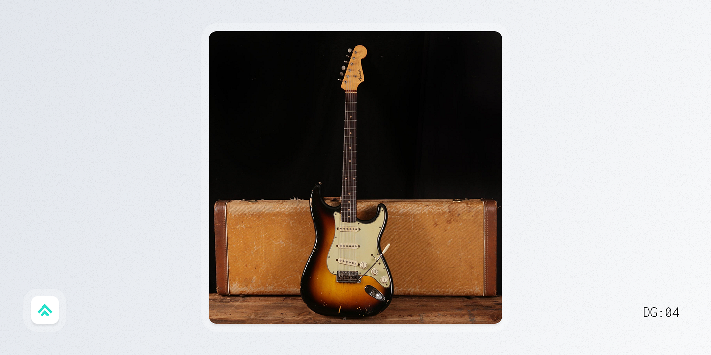
The Fender Stratocaster
Taste of Quality #4
Hello designers! 👋
Our little community has now grown by over 250% in the last 10 days which is just incredible! Give yourselves a round of applause! 👏
To the new folks: welcome! And to the return folks: welcome back!
A couple shout outs to start this week’s design gratitude:
Thanks to David Hoang for sharing the newsletter with his network on Twitter. So cool to see new folks join based on his recommendation. If you don’t know David, he’s Head of Product Design at Webflow and also writes his own Substack, Proof of Concept. Check it out for more design goodness!
Thanks to Varada Gavaskar and John Peele for buying me coffee last week. Your support means a lot to me! 🙏
To the rest of you fine folks, thanks for being here. I hope to add some value for each of you in our collective quest to become better designers.
With that said…
Design Gratitude 🙏
This week I’m grateful for the Fender Stratocaster.
Even after a decade of working in design and tech, I’m still routinely blown away by the number of other designers who share my passion for music. So I thought I’d share a music-related design that’s meaningful to me today.
One of my prized possessions is a Fender Stratocaster that was the first big purchase I saved for and bought with my own money as a teenager. I’m sure at the time I appreciated it for looking cool (and hopefully making me look cool by association 😆), but now I appreciate it on a whole different level.
So why’s it a good design? Let’s count the ways.
Rams Principle #1: It’s innovative
There are a lot of little innovations rolled into the Strat, but a big one is the tremolo. Tremolos already existed when the Strat was being developed, but Leo Fender’s design opened up a whole new level of expression for the instrument. That opportunity for expression then became an iconic, sonic building block for the musicians that gravitated to the Strat in the decades after its release.
Rams Principle #2: It makes a product useful
While the Strat is very aesthetically pleasing (I’m especially fond of the dual tone sunburst color seen above), at the end of the day musicians love it because it’s a true workhorse electric guitar. But don’t take my word for it, take Eric Clapton’s:
“My feeling about a perfect design is that it has to be functional, and with the Strat its functionality really steers it. That’s what makes the design so beautiful. It’s superbly thought out.”
Rams Principle #8: It’s thorough down to the last detail
Leo Fender cared deeply about designing an instrument that aligned with how musicians would use it. To get that alignment he even spent “about 25% of every day… visiting musicians to try to figure out what would best suit their needs.” You can see this attention to detail manifest in a decision like creating a contoured guitar body which slopes both along the back (to rest better against the musician’s torso) and the front (to allow their picking arm to rest more easily). Truly thorough to the last detail.
Coffee break links ☕
A person to follow
Ehsan Nour - Product Designer at Eraser
Ehsan just announced he’s joining the team at Eraser to help build a digital whiteboarding tool specifically for engineers. After having watched folks on my team struggle to collaborate remotely on complex systems modeling it’s exciting to see a great team rallying around this problem. Good luck Ehsan! 🎉
A video to watch
The dark side of corporate art - Campbell Walker
This video from designer and illustrator Cam Walker (whose channel Struthless has over 700k subs on YouTube) is a spot-on breakdown of the “Corporate Memphis” art style that took over many tech visual identities in the last decade. The history is interesting in its own right and Cam’s videos are always super engaging and well crafted. Highly recommend!
A website to check out
A couple weeks ago I shared Nat Friedman’s minimalist personal website and it got me thinking about web designs that intentionally push away from visual polish.
I came across this aptly named site, “Brutalist Websites”, that catalogues all sorts of bold designs. Brutalism isn’t a style that I personally gravitate to, but I found it pretty inspiring to see so many creative and weird designs that often feel like they’re breaking every “rule”. It’s a good reminder that sometimes you need to push the boundaries just to figure out where you really want your boundaries to be.
Until next time ✌️
Pat
Recently on Design Gratitude 🔙
If you got a little value in this post, consider subscribing, sharing or following me on Twitter. If you got a lot of value I’d appreciate it if you bought me a coffee 😎 ☕️.


