


Figma Helpers: the custom library I use to kickstart my designs
Aka. design systems aren't just for the product anymore!


Front matter:
The single most important thing 💡
Design systems aren’t just for the product. You can (and should!) design systems for yourself to facilitate your own unique design workflow.
Resource:
Grab a copy of this library from my Gumroad shop to support your own work! 🥳
Starting from scratch at JupiterOne
When I started at JupiterOne we didn’t even have a Figma account.
In terms of product design assets, I was starting from scratch.
At the same time, the codebase was big! There were multiple sophisticated feature sets with lots of distinct UI built over time by a bunch of developers and teams.
Dropping into this context, I had to pragmatically answer one big question right away: How could I maximize my output while maintaining quality as a single designer supporting an entire engineering org?
My answer was clear: tools & systems.
Yes, of course, I eventually wanted to establish the kind of product “design system” you hear talked about reverentially on design Twitter. But before I could even consider imagining that dream I just needed to manage the chaos.
I needed to start crafting my own design toolkit to help myself stay organized and work more efficiently to support the fast pace of the start-up.
This post goes into the first asset I created for myself: a utility library I simply call “Figma Helpers”. Let’s dig in! ⛏👷

The file thumbnail
You’ve probably seen versions of these floating around Twitter or the Figma community. As far as I’m concerned they’re a pretty commonplace organizational tactic at this point.
Despite their popularity, you still have to make them yourself. Since it’s an asset that you likely want to re-use across the majority of your files it makes sense to create it as a library asset ASAP.
This obviously helps with consistency and the ease of finding files, but it’s also critical if you ever decide you want to update the design of your thumbnail. You’ll be in a world of pain trying to make that update without it being a library resource. Trust me. Been there 😅.
The things I include on my thumbnail are:
The file name - which I often (but not always) align to my dev team’s ‘project’
Type of work - which I use to add a little extra context on the file’s intent
A description - which I use for more... uhh... description... 🙃
A status - which I use to visually keep track of where the design’s at
Our logo - which I include as a simple, minimal brand touch
I maintain two variants of this component: a light variant for most files and a dark variant for library files.
A couple implementation specifics:
Figma requires these to be a specific size to fill the full view in the file grid layout. They officially recommend 1600 x 960px.
I include an 8px border-bottom in a light grey to make it appear as if the cover connects with Figma’s default tile grid UI.
You will need to wrap the component instance in a Frame, then set that wrapping Frame as your custom thumbnail.
For more detail here’s the link to Figma’s docs on this topic.

The Documentation Page
This component was a little bit forward-looking work on my part when I started but I went ahead and included it since I knew I was going to be working on component documentation soon enough.
I prefer a page-separated component library, so these elements help me give the appearance of a documentation page without the additional nesting in the Figma Assets panel that would result from actually wrapping components in a Frame.

The Documentation Page Header
Within the Documentation Page I include a header with the element name, description, current status and links to its code counterparts. It supports a number of different combinations of those elements so that I have a lot flexibility for adding just enough descriptive content for any given context.
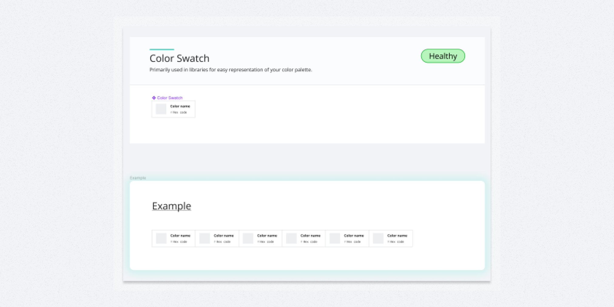
The Color Swatch
Besides these helpers, the other thing I always set up almost right away is a basic set of shared colors styles. Similar to the other items in this kit, they’re something I want to start re-using ASAP across my designs.
I made this color swatch component so that I could easily see three things at once:
The actual visible color
The color name (often aligning to a variable or design-token name)
The hex value
I’ve found that even though I don’t want to be pulling the hex codes directly very often, I do want to reference them often enough that it has made sense for me to keep them up-front.
I used this component extensively while building out the hundreds of colors in my library of the US WDS color system and it held up great!
A couple implementation details:
I keep the pound symbol separate from the hex value so that I can seamlessly copy/paste the value from the page into the Figma style panel (which doesn’t need the #).
I don’t use border-radius on the corners so that I can easily use auto-layout to create a connected color stack (as shown in the example).

The status component
I technically have two status components:
‘File Statuses’ which appear on my file covers
‘Component Statuses’ which appear on my documentation pages
I use these to roughly keep track of what state each of those items might be in.
I include a grey placeholder in each set as a default alongside an assortment of statuses that make sense for me at the moment.
I definitely don’t have an an exact science for maintaining these, this is just the set I’ve found helpful for communication as of late.
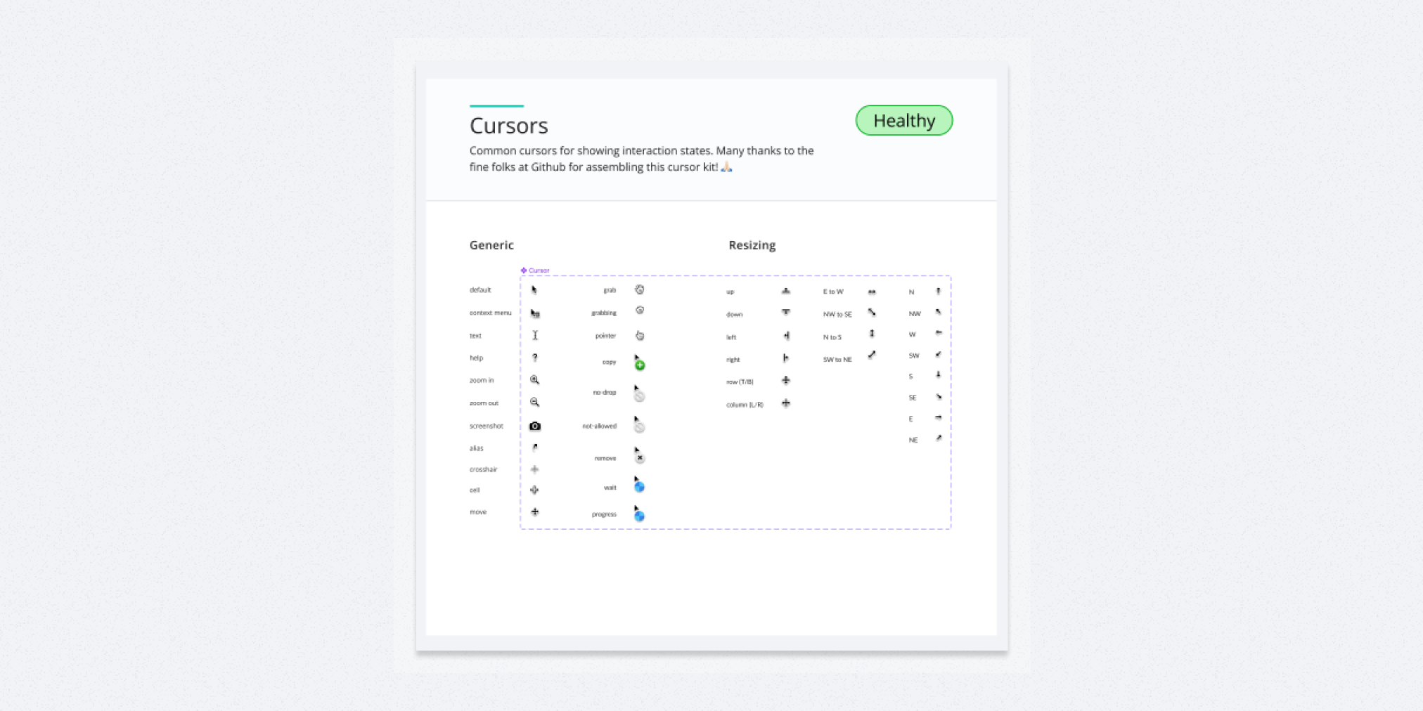
Cursors
I can’t take any credit for this. I just nabbed it from the Github Primer team’s Figma library to help me be more clear when conveying different interaction states for my company’s desktop oriented applications.
Here’s the specific file: https://www.figma.com/community/file/854767373644076713

Notes
I know, I know. I should just use FigJam if I need sticky notes now...
But I don’t really use these for ideation. I use them more for documentation around my visual designs or storyboards. I’ve seen some folks in the community come up with more interesting ‘Note’ components but for now this works for me.
Apparently I’m old fashioned in my note visual design taste. Who knew? 🤷♂️

The title canvas divider
The last thing I added was a basic divider component to help me break up sections on the canvas. I often want to distinguish certain groups of screens from others within a page and this simple component helps me create that visual clarity in a consistent fashion!
Conclusion
I hope you find this idea of building your own support libraries helpful.
It’s a practice that has helped me facilitate my own work and it’s something that I’m constantly iterating on as I come across new re-usable pieces that might further improve my workflow.
Similar posts

If you got a little value in this post, consider subscribing, sharing or following me on Twitter. If you got a lot of value I’d appreciate it if you bought me a coffee 😎☕️.