How I Elevate My Presentations with Figma
7 tactics that turn Figma into my presentation tool of choice
Hello! I’m Pat and Better by Design is my newsletter sharing pragmatic insights for creative innovation through the lens of design. If you’re new here, join our growing tribe of design innovators!
Last week, I shared the IMPACT framework which uses design thinking to drive change in tech organizations. One key part of IMPACT is 'A' for articulate: you need strong presentation skills to build your influence.
Crafting good presentations has always been a challenge and traditional presentation tools often did more to restrict, rather than help me. Every time I started a new slide deck in Google Slides or PowerPoint my blood pressure would rise. Their layout and formatting options would frustrate me and their long list of slide thumbnails would confuse my argument instead of clarify my ideas.
Good presentations need two things: a clear story and eye-catching visuals. And I had a hard time achieving either with those tools.
Then, I switched to Figma.
Now, I use the full extent of my skills as a visual storyteller without fighting the tool.
Although Figma wasn’t originally made for presentations, it was easy to configure a basic setup that delivered on my needs. With just a little bit of effort, I created a kit that helps me start new slide decks quickly. The best part? Unlike traditional slide tools, Figma stays out of the way, letting me focus on my ideas.
In this article, I'll share the 7 steps I take to transform Figma from a general design tool into an effective presentation tool. These little configurations simplify the tool and help me concentrate on what's important: clearly sharing my ideas with the audience.
I hope they help you too!
P.S.
I know Figma isn't always an option for presentations. Like many others, I still have to use standard tools when the scenario calls for them. I'll talk about those another time. Today, let's focus on how Figma can help in ideal situations.
7 ways I configure Figma for presentations
#1. Organize the Account: One Presentation Per File
Let's start with how I organize things at the account level.
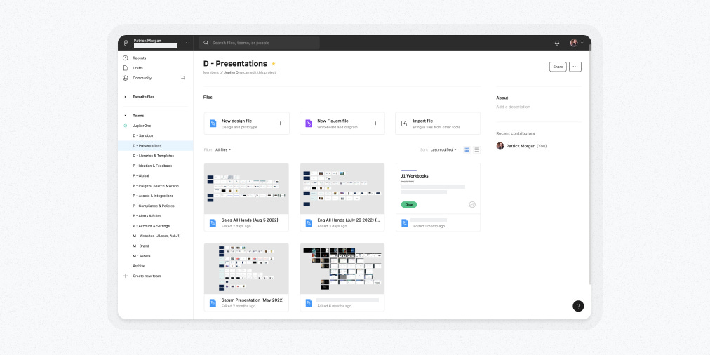
I have a dedicated Figma 'Project' just for presentations. This keeps them separate from other product-focused design work, making them easy to find and avoiding any mix-ups.
I stick to a rule: one presentation per file. Storing multiple presentations on different pages in a single file didn’t scale well and made it harder for me to remember where specific slides lived. By keeping each presentation in its own file, I avoid this confusion.
Now, let's talk about file thumbnails. For product-focused design work, thumbnails are useful for tracking progress and coordinating with development projects. However, for presentations, I found thumbnails less helpful. So, I skip them. Interestingly, I’ve discovered that seeing the overall 'shape' or structure of a presentation helps me identify and differentiate them more effectively than a thumbnail ever did.
#2. Structure Pages within Each File
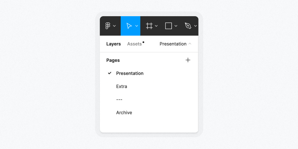
In my presentation files, I follow a three-page system.
The first page is the key: the presentation itself. When I share a file link, I noticed most people don't look beyond the first page. So, by placing the main presentation here, I reduce confusion.
The second page serves as a repository for extra slides. These are often well-developed ideas that didn't make it into the final version. I keep them close because they might be useful later.
The third page is my 'archive' where I store ideas I'm unlikely to revisit. This includes random experiments and concepts that didn’t quite pan out. I rarely delete slides, but archiving them helps keep my workspace focused.
#3. Design Slide Variants for Clarity
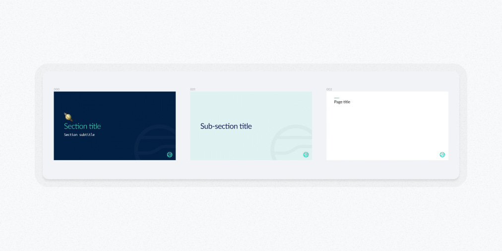
In my presentations, I rely on three core slide variants: a section title slide, a sub-section title slide, and a standard slide.
I style these three variants distinctly to visually signal shifts in the presentation's topics. Here's how I differentiate them:
Section Title Slides: I use a bold, brand color scheme for these. They mark the beginning of a new major topic.
Sub-section Title Slides: These are in a secondary brand color, signaling a sub-topic within the main section.
Standard Slides: They are simple and clean, with a flat white background, perfect for detailed content.
To streamline my workflow, I keep a component version of these slides in a new presentation template. This setup helps me get started quickly. However, in any specific presentation file, I immediately detach the component instances so I can add content directly into the Frames.
#4. Leverage Figma Presentation Order
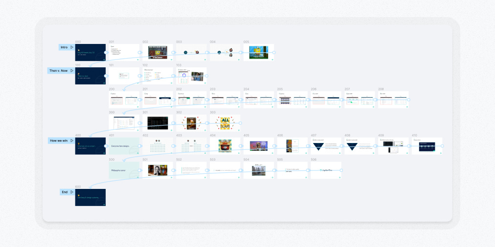
A crucial aspect of organizing your presentation frames in Figma is arranging them left to right, then top to bottom. This isn't just a preference—it's essential. Adhering to this pattern ensures that Figma's presentation mode automatically cycles through the frames correctly.
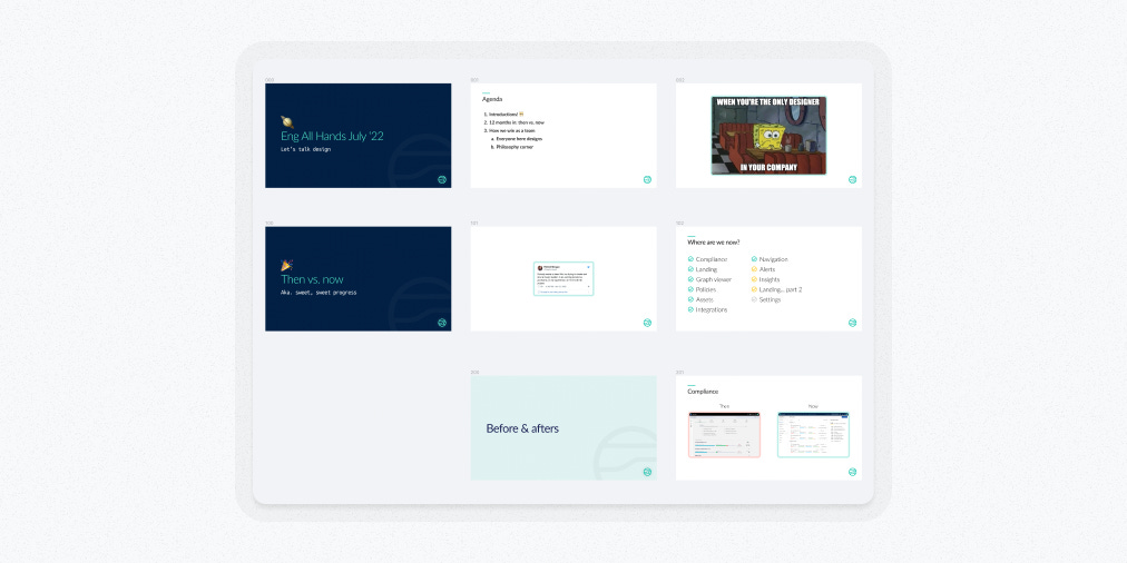
Here's my approach: I begin with a section title slide and progress horizontally to narrate that section. Once the section concludes, I move down to start a new row for the next section. For long sections, I create extra rows, each representing thematic groups within that section.
Sub-section title slides are useful for formally dividing long sections. While I don't always use them, they’re handy when a distinct thematic area enhances the story's flow.
This left-to-right, top-to-bottom layout isn't just about order—it's about visually capturing the story arc of each row and the entire presentation. When it comes to understanding your narrative, this spatial layout significantly outperforms the stacked list of thumbnails in traditional slide tools.
Interestingly, this approach mirrors the methods we used at Leo Burnett to create decks for multi-million dollar ad campaigns. Back then, we used Keynote, printed the slides, and physically arranged them on a wall to achieve this overview. Now, Figma allows us to do this digitally, simplifying the process dramatically.
#5. Automate Frame Naming
When it comes to naming slides, I keep it simple: I don't name them.
Why? Because in presentations with dozens of slides, updating each frame's name manually every time I make a change is just too much hassle.
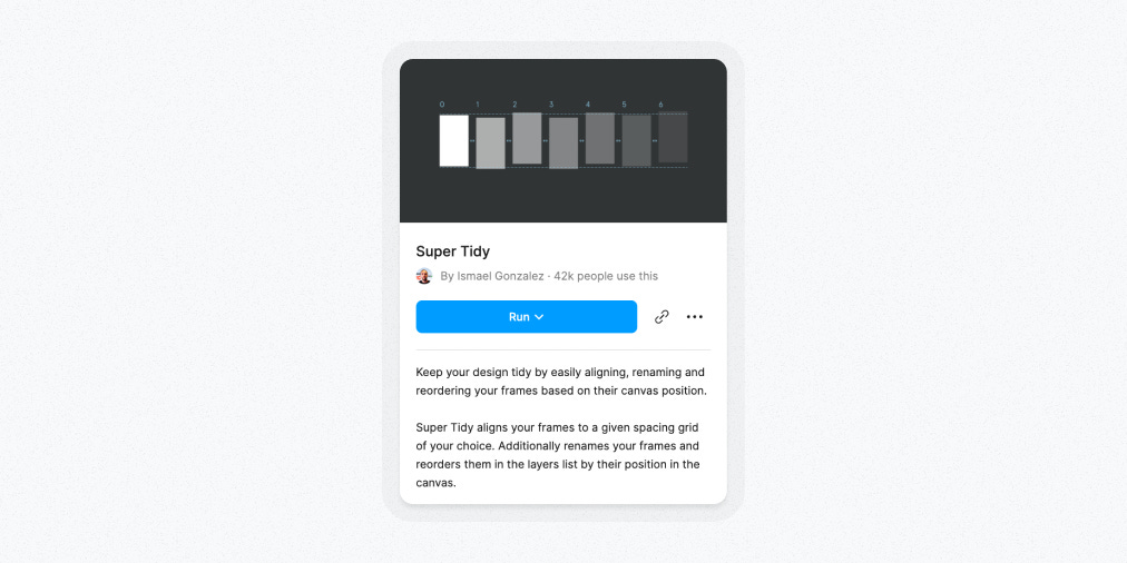
Instead, I use a game-changing plug-in: Super Tidy by Ismael Gonzalez. This tool transformed how I handle slide naming.
Here's how it works: I select all the frames I want to rename and choose the 'Rename' action in Super Tidy. The plugin then renames the frames based on their position on the canvas. This order matches how Figma will read them in presentation mode.
The naming starts at 000 for the first row, moving left to right (so, 001, 002, and so on). Each row below increments the first digit (000, 100, 200, etc.). It's a neat, orderly system that saves me a ton of time.
This automated process speeds up my workflow significantly. It gives me the flexibility to move slides around, placing them exactly where they fit best in the story and where they’ll make the most impact.
An added bonus? Super Tidy can also 'tidy' your frames by adjusting their spacing on the canvas.
#6. Use Shared Styles
Beyond my three slide variants, I haven't gone too deep into creating many shared styles specific to presentations but they can be useful.
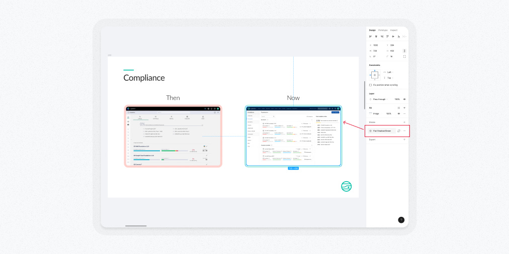
One example of a shared style I've implemented: a box shadow effect for the numerous images in my slides. This shadow aligns with the brand color palette and gives the images an extra visual pop. In Figma, adjusting box-shadow values for each image can be tedious. So, creating a few shared styles for this effect saves me time and helps with visual consistency.
#7. Add a Splash of Interactivity
A special touch I like to add, time permitting, is prototype animation.
Since I’m using Figma, I can tap into the same prototyping tools I use for product UI design. But here, the animations are much simpler: mostly easing the transitions between key points in my story.
My starting point is to link the container Frames of all slides with a basic ‘Smart Animate’ interaction. Often, this is enough to smooth out the experience. Sometimes, Smart Animate creates unexpected artifacts. In those cases, switching to a different animation type, like a simple dissolve, usually solves the problem.
As an extra organizational step, I sometimes create separate, named prototype ‘Flows’ for each major section of a presentation. While this doesn’t add major value, it's a nice touch for final organization.
⚠️ Two important warnings ⚠️
Reordering frames becomes a hassle once you've added prototype links. So, I suggest doing this only when your presentation's order is final and unlikely to change.
Once you link one frame with a prototype interaction, the rest won't show up in presentation mode unless they're also linked. It's an all-or-nothing deal, so plan accordingly.
Final Thoughts
Adopting Figma was a big boost to my presentation creation process.
The tactics I outlined, including automating slide naming, using shared styles, and incorporating animations, establish an efficient baseline workflow.
With those essentials streamlined, I'm now free to harness Figma's key presentation strengths: superior styling and a more coherent narrative flow on its visual canvas.
Now I can focus on crafting presentations that tap into my full skillset as a visual storyteller – a big win in my book.
Until next time,
Pat 💚
If you got a little value from this post, consider subscribing, sharing, or following me on X/Twitter. If you got a lot of value, consider pledging to support my work with a paid subscription in the future.


