How I Make an Aesthetic Figma Thumbnail Component That Scales
A UI tutorial showing my process, including a video recording you can follow and a Figma community file you can save
Hello! I’m Pat and Better by Design is my newsletter sharing pragmatic insights for creative innovation through the lens of design. If you’re new here, join our growing tribe of design innovators!
Heads up! This post contains:
📖 The article with context & instructions
📹 Video work session (~45min, chapters & playback speeds via Loom)
⚒️ Figma community file (duplicate for your own personal use)
Design context
Feeling like your Figma account could use some tidying?
I know, I've been there.
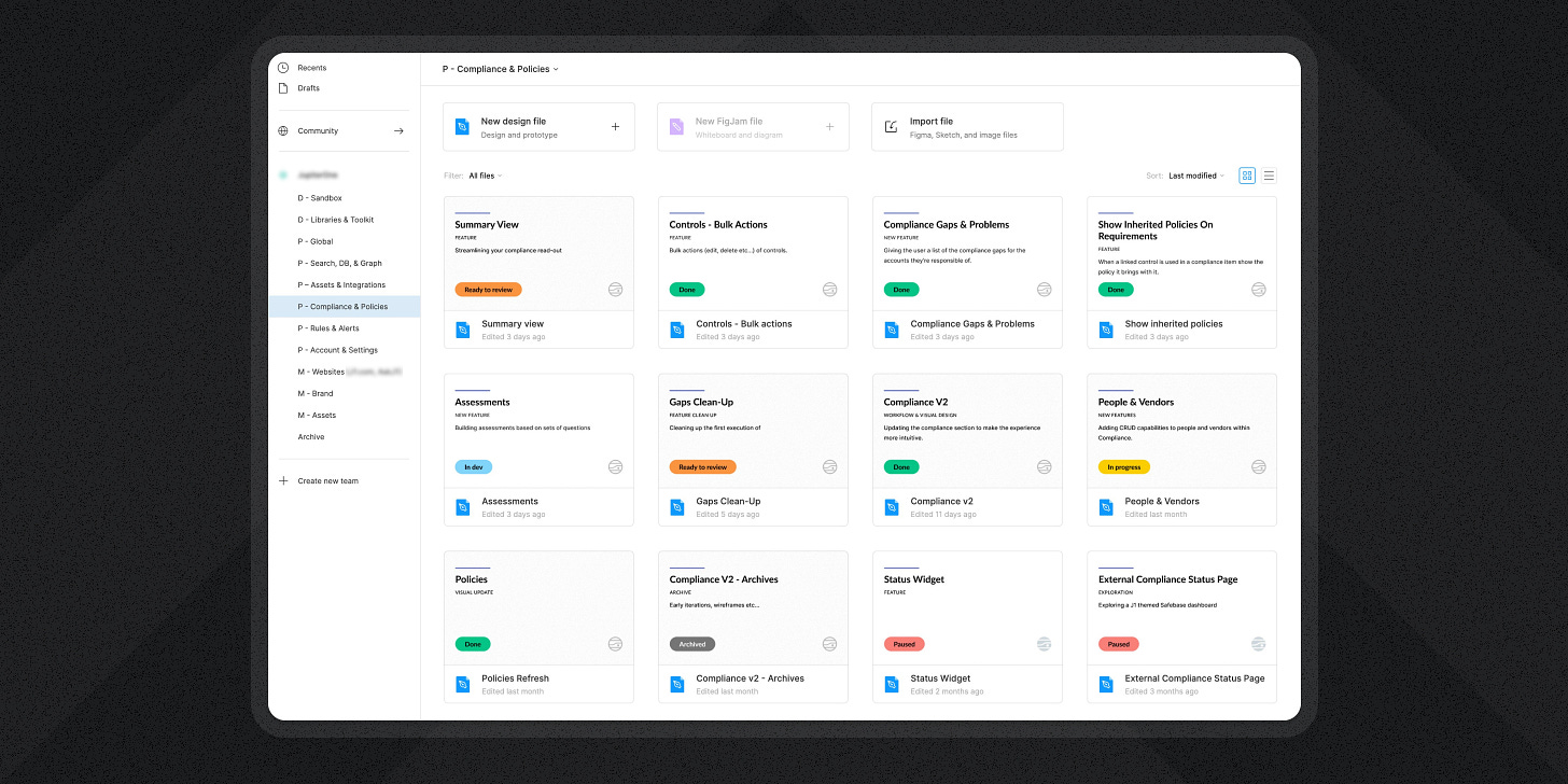
A little over a year ago, a screenshot of how I organized my team’s Figma account went viral (the one in the feature image above). As with any viral tweet, some people loved it and others hated it. But I wasn’t trying to impress anyone with the setup, it just served a few practical purposes that helped me manage the workload as a lead designer at a growth-stage startup. At one point, I was supporting a team of 40+ engineers on my own so I needed every bit of leverage I could get to ensure quality work made it through the dev pipeline consistently.
My primary goals with the file thumbnail were to:
Emphasize the name of the work (to align with its name in Jira)
Emphasize work status (again to align with Jira)
Distinguish between active and inactive files
Distinguish between standard design files and libraries
Make thumbnails feel like an extension of the Figma UI (my personal preference)
While your mileage may vary, this setup worked well for me and my team and allowed me to take the company from zero to dozens (low hundreds) of files in the account with little confusion.
Since that time, Figma has updated their file collection UI so a few of the tactics I used to achieve the previous design are no longer needed. The good news is, that thanks to those changes, it’s now easier to achieve a nice look with less fancy footwork.
So today I’m going to walk you through the steps I followed to build that file thumbnail component. It’s minimal and scales well for small teams focused on delivering value quickly and consistently in a distributed environment. That’s a win in my book.
In addition to the basic written instructions below, I’ve included a video of me doing the work so that you might be able to see the real process more clearly. This is not a highly edited YouTube video; it’s like a candid work-along with me as your friendly, remote co-worker. I personally find it easier to learn and repeat any process (particularly design and development) if I can watch someone do it even once, so this is my attempt to share that kind of learning experience with you.
I’ve also made this file free and available to download from the Figma community if you’d like to grab a copy for yourself to kickstart your organization. While you’re over there, I’d appreciate it if you could like and/or bookmark the community file too 🙏.
What other UI would you like to see me deconstruct and rebuild? Reply via email, leave a comment in Substack, or tag me on X to let me know! I’m currently building my backlog and would love to tailor it to what the community is most interested in.
Video work-along / tutorial
👇View my recorded work session👇
🔗 Inside Look at Designing File Thumbnails in Figma - Watch Video
This session took about 45 minutes. With the video, you can:
Use Loom’s playback controls to speed it up or slow it down to your liking
Skip around using the titled chapter markers
Reference the AI-generated transcript & closed captions
I tried to voice over what I was thinking/doing as much as possible to make it easy to follow along.
Basic thumbnail design instructions
1. Make a Frame that's the right size
1600x960px suggested (via Figma Docs)
Name it 'File Thumbnail'
2. Match the Frame background color to the theme you prefer
I use #FFFFFF for light, and #1E1E1E for dark
3. Add the file name & details
These are the styles I use. Remix as you see fit.
Add the content
<hr> 8px height, brand color fill, border-radius
<file name> 80px font size, bold
<type of work> 56px, semibold, uppercase
<description> 56px, regular
Wrap in an Autolayout Frame
Set attributes to packed, vertical, 40px spacing in-between
The three text layers should 'fill container' horizontally and 'hug' vertically.
Account for theming
If light theme → use dark grey text (I use #1B1B1B)
If dark theme → use white text
I also swap the brand color on the <hr> to a lighter version in the dark theme
4. Status & Logo
<status> Use an instance of a separate 'Status' component for design files.
Watch me create this component in the video, starting at the 24:41 timestamp.
<logo> Your logo in a color that's low contrast to the background. (optional)
Wrap these two in an Autolayout Frame, set to space-between, horizontal
5. Set your two content containers to the appropriate width
1400px width suggested
Center them in the parent Frame
6. Make 'File Thumbnail' a component
Make this a component and publish it from a Library file in your account.
Using instances from a library component is key to the long-term scalability of this pattern.
If you’re creating both light and dark versions, combine them as variants with a ‘Theme’ property to toggle back and forth.
7. Set/expose component properties
I use component properties to expose:
File name → Text property
Type of work → Boolean property & text property
Description → Boolean property & text property
Status → Nested instance property
These give me a more immediate sense of what I can configure in the instances
8. Set as thumbnail
Wrap an instance of your new File Thumbnail component in a Frame and set that Frame as the file thumbnail (available in the right-click menu).
This is required, as you can't set a component instance as a thumbnail, only Frames.
Set the content to whatever makes sense for you!
And voila! Use this component across your files until they look super sharp, clear, and consistent. Lather, rinse, repeat. 💚
If you got a little value in this post, consider subscribing, sharing, or following me on Twitter. If you got a lot of value I’d appreciate it if you bought me a coffee 😎☕️.


