How I Use Figma to Craft Better Presentations
Guidelines for showcasing your strength as a visual storyteller.
Hello! I’m Pat and Better by Design is my newsletter devoted to great design, quality business, and prosperous creative life. If you’re new here, join 2100+ creative professionals as we uncover new insights each week.
Hey friends! 👋
I’ve been thinking a lot about presentations and how important they are to designers.
When you’re starting out in design no one mentions how much of your job will eventually be doing the rounds, advocating for good design, and trying to rally people in other disciplines to your cause. But as your career progresses, that becomes the case more and more and presentations make up a core part of that process.
While I could (and probably will) write an entire post about embracing the inherent politics of tech companies to create better opportunities for product design to thrive, today I want to focus on the craft of building presentations.
My current company has an official slide deck template for Google Slides that was created by our brand design team. However, when I can, I prefer to use Figma because it allows me to be more visually expressive and helps me see the structure of my message more clearly.
As a designer it feels good to be able to showcase my strength as a visual storyteller, so I hope that by sharing the basic guidelines that I follow you’ll be able to unlock more opportunities in that area for yourself too.

One presentation per file
First up: account level organization.
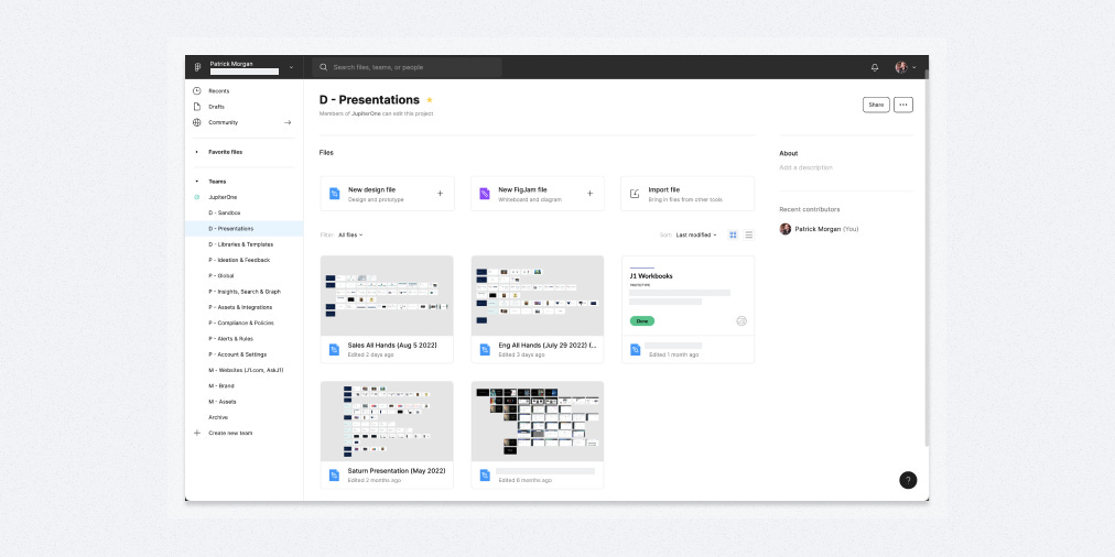
I keep a separate Figma ‘Project’ specifically for presentations so that they’re easy to find and don’t get confused with other product-focused design work.
I also set a limit of one presentation per file because I’ve found it becomes hard to find old presentations if I tuck them away in multiple pages within one file. File level separation resolves that issue.
Unlike other product-focused design deliverables, I skip file thumbnails for presentations. I’m not trying to track status of presentations or link them to specific development projects, so I found that the thumbnails didn’t help me as much. It also turns out that seeing the “shape” of the presentation often helps me distinguish one from another more than a file thumbnail would.
File page structure
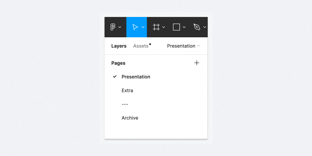
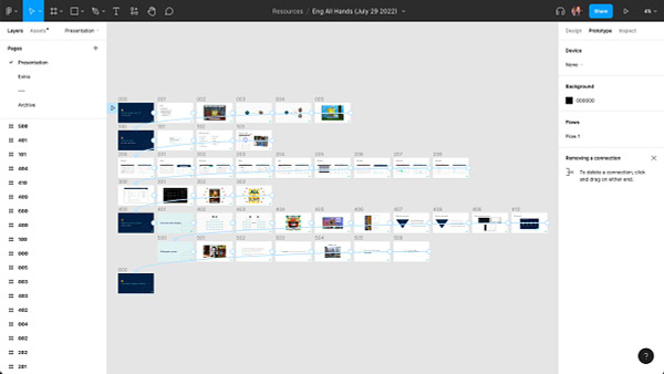
I tend to keep three pages in presentation files.
On the top page, I always keep the presentation itself so that it loads by default when the file opens. That’s helpful for me of course, but more important because I’ve noticed that others often won’t look past the first page when I share a link to the file. So keeping the core presentation in that spot limits confusion.
On my second page, I keep extra slides that I may want to come back to. Often they’re fully fledged ideas that just didn’t make the final cut.
Finally, I keep a third page for “archived” ideas that I probably won’t come back to. This includes random explorations, ideas that didn’t really work, etc… I never throw away ideas but I definitely archive them to get them out of the way!
Slide variants
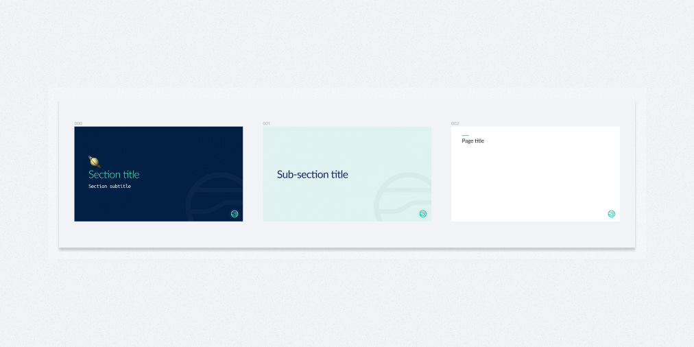
I maintain three core slide variants: a section title, a sub-section title and a standard slide.
Those three variants are styled differently to help visually differentiate when I’m entering a new topical area of the presentation. For me, section titles use the bold, dark JupiterOne Navy, sub-section titles use the light JupiterOne green and standard slides use simple, flat white.
I keep a component version of these slides in my Figma Helpers library, but only use the component as a base for getting started quickly. I detach it immediately in any presentation file because I want to drop content directly in those frames and not mess around with wrapping component instances.
Frame structure
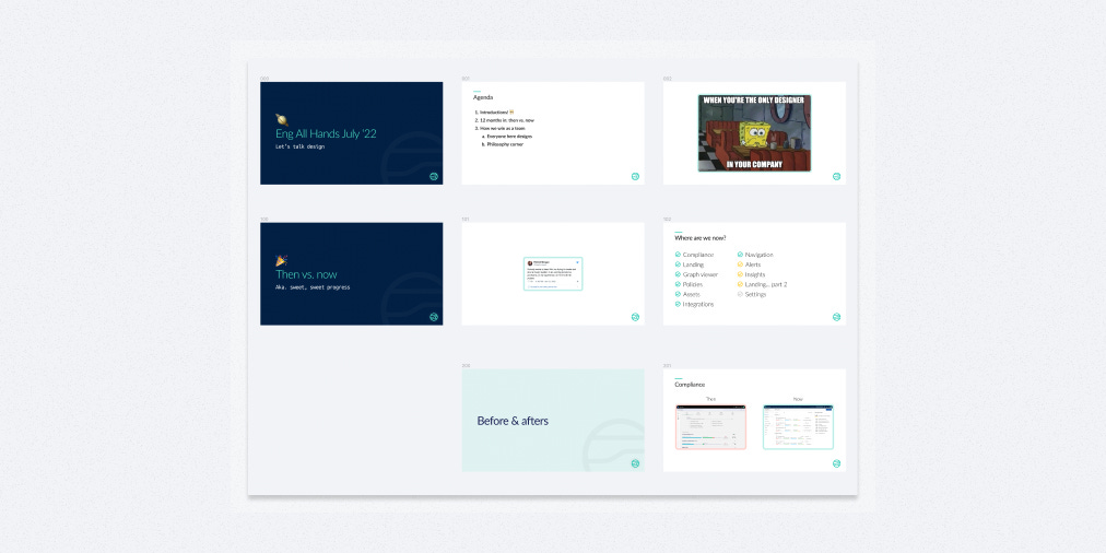
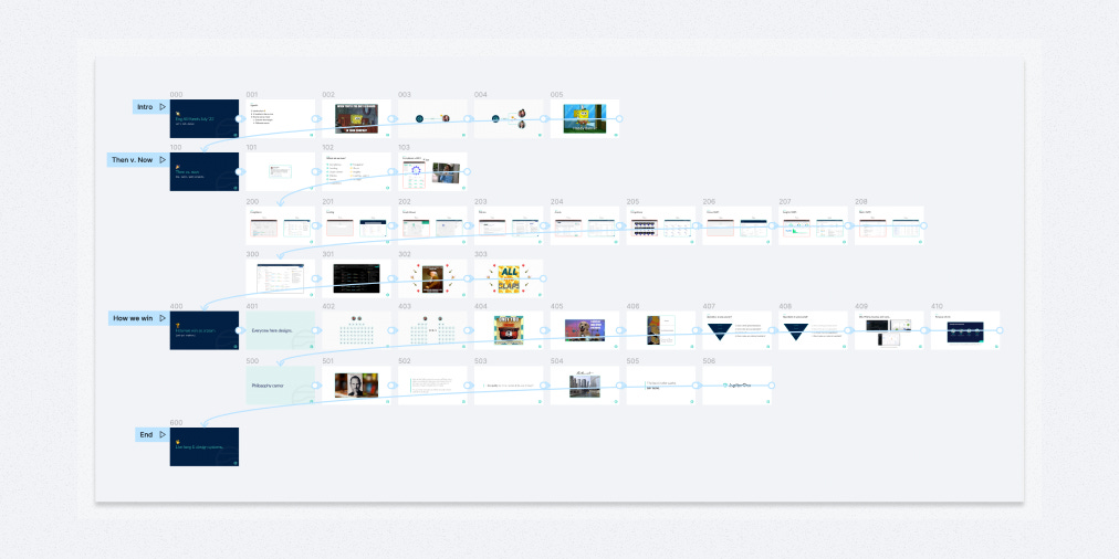
The key to organizing your presentation frames is ordering them from left to right, then top to bottom.
This is important! You need to follow this pattern in order for Figma’s presentation mode to automatically cycle through the Frames on the page correctly.
I start with a section title slide, work my way across that row to tell the story of that section, then bump down to a new row when I’m ready to start the next section. In the case of very long sections, I tend to break out extra rows based on thematic groups.
Sub-section title slides come in handy when I want a more formal division of a long section. I don’t always use them, but I will when it feels like it helps the story to have a more clearly distinguished thematic area.
Following this left-to-right, top-to-bottom convention and being able to visually see the story arc of individual rows as well as the entire presentation is a game-changer. It absolutely crushes the traditional stacked list of thumbnails you get in most other slide creation tools.
What’s even more interesting to me is that this structure aligns with the methods we used for crafting decks at Leo Burnett that sold multi-million dollar ad campaigns. The difference was that in those days we had to make slides in Keynote, print them out and tack them up on the wall to be able to get this kind of view.
Naming frames
I don’t give my slides descriptive names. I think it’s a waste of time.
I often change the message of slides on the fly while I’m iterating on the story and it’s way too cumbersome to continually go back and update the name of each individual frame in presentations that have dozens of slides.
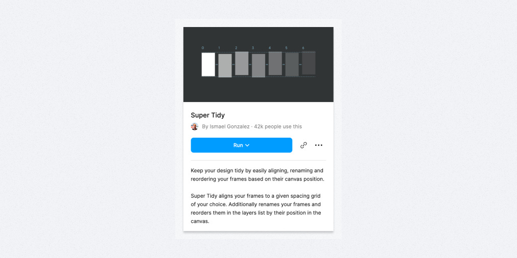
So instead of manually renaming frames, I automate the process by using the wonderful plugin Super Tidy by Ismael Gonzalez.
Using Super Tidy is dead simple: first, you select all of the frames you want to affect, then you choose the ‘Rename’ action. Super Tidy will then rename the selected frames according to their order on the canvas; the same order that Figma will read through them in presentation mode.
The first row starts with 000 and works left to right, incrementing by 1 (so 001, 002, etc…). Then each subsequent row below the first increments the first digit (000, 100, 200, etc…).
This automation lets me move much faster and feel like I have a lot more flexibility to constantly shift slides around to the place in the story where they make the most sense and will have the most significant impact.
As you might expect, Super Tidy can also ‘tidy’ your frames (aka adjust their spacing on the canvas) which can be useful too.
Styles
Outside of the styling of my three slide variants, I haven’t gone too deep into building presentation-specific shared styles. It hasn’t been a priority for me since I don’t give that many formal presentations and usually prefer the flexibility of a mostly blank canvas.
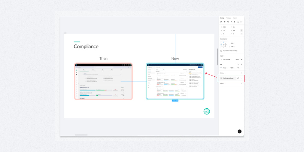
The biggest style helper that I have implemented is box shadow that I use to wrap the many images I include in my decks. They align to the JupiterOne color palette and just help the images pop that extra little bit. I find it pretty cumbersome to dial in individual box-shadow values in Figma so it felt natural to create a couple of shared styles to apply across the board.
Interactivity
If time allows, the final thing that I add to a presentation is prototype animation.
Since we’re in Figma, we can leverage all the same prototyping tools we might if we were building an actual prototype of product UI. But in this case, I like to think of my presentation as a really basic prototype: it’s not trying to capture all the statefulness of an application but it is trying to smooth out transitions from point to point in the story that I’m trying to tell.
I personally start by linking together the container Frames of all the slides with a basic ‘Smart Animate’ interaction and see what happens. Honestly, that’s often enough to smooth the rough edges. Occasionally Smart Animate will create some weird artifacts, in which case I’ll swap the animation for another type (often just a simple dissolve) and that tends to fix the issue.
As a final touch, you might also find it helpful to create separate, named prototype ‘Flows’ for each major presentation section as one more way to reinforce the structure. It doesn’t add that much value, but it’s nice as a final layer of organization.
Two warnings ⚠️
It becomes a big pain to re-order frames once you’ve added prototype links, so only venture down this path once the order of your presentation is very solid and unlikely to change.
Once you link one frame with a prototype interaction, the rest won’t appear in presentation mode unless you also link them. So, it’s all or nothing unfortunately 🥲.
Outro
Do you make presentations in Figma?
Does it make sense for you to make presentations in Figma given your workflow?
Let me know in the comments or on Twitter! I’m curious to see how other folks are approaching this powerful tool for visual storytelling.
Similar posts
If you got a little value in this post, consider subscribing, sharing, or following me on Twitter. If you got a lot of value I’d appreciate it if you bought me a coffee 😎☕️.


