Design to Win: How I Use the Power of Competition to Unlock Better Design
The strategic use of competitive, complementary, and comparative research
Hello! I'm Pat, your guide to the business of creative technology and innovation. New here? Join our supportive community to fuel your creative journey!
Intro
This week I want to talk about using the power of competition to strategically create better design outcomes.
How might we surface the most “good design”?
I spent the last half-decade at cyber-security startups ranging in size from 40 to 1,000 people. These were highly technical, engineering-driven, software companies that required design to shape their product, but that were very much not in the design business; they were in the cyber-security business.
Consequently, the size of the design teams was small: ranging from 1 to 8 people. While on the other hand, the size of the engineering and sales teams numbered in the tens to hundreds.
With so few designers relative to the total number of people making design decisions, it was easy to feel like the design was constantly slipping away from the designers’ intent. While I struggled with that dynamic at first, I shifted my perspective over time from asking “How can I help the design team make great designs?” to “How can I help the broader team surface more good designs more often?”
The trouble was that since those other people weren’t designers they often didn’t have a strong point of reference for what good design looked like and so it was tricky to figure out what would help them.
The power of comparison
After some experimentation, the most reliable and approachable tool I found was providing the team with clear and consistent “competitive” design resources.
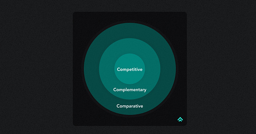
I put competitive in quotes because I include a spectrum of resources in my toolkit ranging from direct competitors to complementary software products to more abstract pattern comparisons.
While I may never achieve my quest to teach every coworker to critique designs like Dieter Rams, people are instinctively good at comparing things when they’re put side-by-side. Even if they don’t have the words to express exactly why one design is better or worse, most people will have a feeling.
And so for the rest of this piece, I want to break down how I curate my competitive resources and how I queue them up for different audiences to guide them toward better design.
My “competitive” toolkit
Figma audit file
The core of my competitive toolkit is an ongoing audit file in Figma that I curate and maintain like a library.
I organize the pages around the 3 main categories I mentioned above:
Direct competitors: The companies we go up against in sales deals
Complementary software products: In my case, other enterprise software
Comparative experiences: A wide net of common software patterns
I start with direct competitors at the top of the file, venture outwards to the broader complementary set, and then finally include more abstract pattern-based comparisons.
I date each page so that I remember the point in time it reflects for that software and I leave copious notes directly on the screenshots within the file.
Wiki documentation
For the designers on the team, the Figma file is often enough.
But for others outside the design team, I maintain basic documentation on the team wiki so that people can get a high-level view in a space that’s more familiar to them.
These days I’m able to embed individual pages from the Figma file within this document which makes it easy to poke around without having to switch contexts.
Presentation slides
While the Figma file is comprehensive in what it includes, I tend to reach for a few key screens routinely in the context of presenting design strategy.
So, it’s simple, but I keep those common screens prepped and ready in slide format to make it faster for me to reference when the next presentation rolls around.
They occasionally need to be retired and replaced, but for the most part, they’re stable enough to rely upon from month to month.
The right comparisons for the right people
While designers are adept at traversing the layers of abstraction from competitive to comparative others tend to get hung up on the area where they focus most of their attention day-to-day.
This isn’t their fault.
It’s just a manifestation of inherent cognitive biases that we need to account for.
Sharing with engineering & product
These teams spend most of their time internally crafting the product itself.
They care deeply about the product they’re making and so it’s easy for them to fall victim to the Ikea effect: the cognitive bias in which one more highly values an object that they have made themselves. To offset this bias, I’ve found that a jolt of direct competitive comparison is very effective.
The simple exercise of holding up your product next to a competitor for comparison makes areas of improvement much more visible to the team. We may believe that the solution we’ve crafted is great, but our work is mostly for naught unless we can answer this question in the affirmative:
Are we at least as good as our competitors?
If not, we need to keep refining the design until we are.
Sharing with sales & marketing
On the other hand, the sales and marketing teams spend most of their time focused externally on the competition. They care about keeping our company in good standing in the marketplace and thus constantly have to react to the new experiences that enter it.
From this point of view, it’s easy to fall victim to the ‘Appeal to novelty’ bias: “a fallacy in which one prematurely claims that an idea or proposal is correct or superior, exclusively because it is new and modern.”
To help offset this, I’ve found it useful to highlight two points of comparison:
First, show our product vs. our competitors and discuss ways we use design to directly close gaps that our customers consider table stakes. This helps tone down the reactionary response the appeal to novelty can trigger.
Second, share the successes of companies making complementary products that might help us carve a new path. This helps open up the bigger picture design opportunities that exist when we look past our narrowly defined market.
So, the comparative question I posed to the engineering team (“Are we at least as good as the competitor?”) evolves into something more like “Are we moving in a direction that might make our competitors ask if they’re at least as good as us?”
Final thoughts
How do you use competitive resources in your design practice?
What other tools do you like for helping your non-designers make better design decisions?
Let me know in the comments or over on Twitter!
Until next time,
Pat 💚
If you got a little value from this post, consider subscribing, sharing, or following me on Twitter. If you got a lot of value, I’d appreciate it if you bought me a coffee 😎☕️.


