Nintendo Switch: Gaming's Hybrid Darling
How Nintendo's breakthrough portable console rose from the ashes of its innovative, but unsuccessful predecessor.
Welcome to Unknown Arts, where creative builders navigate new possibilities. Ready to explore uncharted territory? Join the journey!
Intro
In the mid 2010s, Nintendo was at a crossroads.
Its latest console, the Wii U, had stumbled out of the gate with a confusing concept, poor marketing, and disappointing sales.
People wondered: could Nintendo bounce back?
But surprisingly, the failure of the Wii U set the stage for a triumphant return. It unlocked ideas that would be central to the company’s next smash hit: the Switch.
How did Nintendo pivot from the Wii U's setback to the Switch's success?
Let's dive in.

Product context
Company
Nintendo has a rich history in both home consoles and handheld devices. While the company had long considered ideas for connecting the two modalities, they mostly operated on parallel paths.
To understand the Switch in the context of that history, it’s useful to go back two console generations to Nintendo’s introduction of the Wii.
With its focus on motion controls and accessible games like Wii Sports, the Wii leaned into creating innovative styles of gameplay that further differentiated Nintendo from the other major consoles of the time, the Playstation 3 and Xbox 360. This bet on innovative gameplay paid off for the Wii, allowing Nintendo to largely play in its own subspace within an otherwise crowded gaming market.
The Wii’s successor, the Wii U, made another big bet on gameplay innovation, this time introducing a controller with a built-in screen that could be used to supplement TV-based gaming or stream games directly from the console. However, the Wii U’s implementation of this innovation didn’t resonate with consumers as much as Nintendo hoped and since the rest of the console’s hardware didn’t stack up well against its competitors, sales struggled. To make matters worse, the name confused many into thinking it was an accessory or upgrade to the existing Wii rather than a new standalone console.
These problems put Nintendo in the position of needing another hit with their next console release. A promising core idea existed within the Wii U, but the specific execution had missed the mark. However, the obvious disconnects were a blessing in disguise, providing guidance toward making an even bigger design leap with the Switch.
Cultural trends
The popularity of mobile experiences had been growing for years before the Switch was released.
While Nintendo was no stranger to portable gaming, this growth emphasized the value of that kind of flexible experience. Previously homebound technologies began to untether themselves with mobile extensions.
Meanwhile, the multi-functionality of smart phones and tablets added a new dynamic for how gaming might co-exist alongside other routine computing needs.
Market
The Switch faced market pressures from two main vectors upon its launch in 2017.
On one hand you had the console stalwarts, Sony's PlayStation 4 and Microsoft's Xbox One. However, Sony and Microsoft both largely catered to gamers looking for powerful hardware and robust online features in a home gaming console. This left a potential gap in the market for casual, family, and on-the-go gamers.
On the other hand, the rise of mobile games on smart phones and tablets meant that Nintendo faced new competition vying for attention in the portable space.
Audience
The Switch targeted a broad and diverse audience of gamers, including:
Die-hard Nintendo fans
Family gamers
Casual gamers
Portable gaming enthusiasts
And more…
Because that’s still a big group, it’s maybe more notable who the Switch did not attempt to target:
High-end graphics enthusiasts
Massive online multiplayer gamers
VR gamers
Monetization
The Switch launched at a fairly standard console price of $299 in the US and charged $60 for its flagship game titles.
Nintendo follows the traditional console monetization model, making profits off of both the console hardware and the software games it plays. However, unlike some of its competitors, Nintendo has historically aimed to avoid selling hardware as a loss-leader for game sales.
The Switch presented a unique opportunity for Nintendo to unite their product line across home consoles and portables. While you could look at this as one product line cannibalizing the other, it’s important to call out the powerful leverage the company gained from the unification. Rather than draining valuable resources to design, build and support parallel home and portable platforms, the company could effectively halve its R&D while doubling the impact of its media library in one fell swoop.
Reduced product expenses, plus increased company focus, plus increased media leverage led to a powerful business engine.

Levers of design impact
Innovation
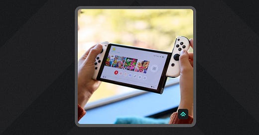
The Switch’s core innovation is its ability to support multiple modalities of play.
Being able to gracefully move from a console to hand-held experience is a real achievement. To then drop a useful tabletop modality in between is icing on the cake for an already good design.
The fact that this innovation was in part born out of the failure of its predecessor is a good reminder that innovation always carries some risk, but that doesn’t mean you should stop taking big swings.
Functionality
The Switch is easy to understand and simple to use.
The simplicity starts with its namesake functionality: switching from TV to handheld mode. It’s as easy as picking the device up off of its charging dock!
Once in handheld mode, the built-in kickstand on the Switch’s back provides an intuitive way to shift again into tabletop use.
On the software side, the main user interface is self-explanatory: a simple list of games that you have available to play. It’s an uncomplicated and understated interface that gets out of the way to put the focus squarely on the stars of the show: the games.
Aesthetics
The Switch is utilitarian in its aesthetics, but manages to leave space for delight.
While the internet might nitpick the Switch’s design, touches of thoughtful execution extend from the hardware to the software.
The standard bright blue and red controllers (JoyCons) stand out visually and balance the simple black core. They’ve also given Nintendo room to play by releasing new colors that allow customers to experiment and customize the design.
There are so many other little design touches that round out the Switch’s aesthetic experience. The satisfying way the JoyCons snap into place when you slide them onto the console body. The micro animations when you interact with UI elements. The sound design as you click across those interactions.
They all work together to deliver a product that’s a delight to use.
Longevity
The status-quo timeline for console lifecycle has historically been ~5 years.
We’re now in year seven of the Switch and the console just had one of its biggest releases with Zelda Tears of the Kingdom.
While there are no shortage of fans wishing for an update, the console continues to deliver in spite of its pedestrian technical specs.
How?
At the end of the day, the games power the longevity of the Switch. Its deep catalog of first party Nintendo titles keeps it playable year after year with software designed specifically to minimize the impact of the technical constraints of the device. Additionally, the Switch has proven to be a great platform for less graphically intense indie games, expanding the content library that makes the platform so valuable.

How to replicate the Switch’s success
“Don’t aim to be the best; be the only.” - Kevin Kelly
Create a space only you can play in
Kevin Kelly’s aphorism applies well to Nintendo’s overall approach to positioning within the gaming market. If you want a general gaming experience, there are many ways to get it. But if you want the Nintendo experience, you have only one choice.
Being “the only” doesn’t just elevate your success in the good times, it protects your downside in the bad times.
Recently, if you wanted to play the new Zelda game, you had to own a Switch. Being “the only” elevated that success.
Previously, Nintendo was able to sustain itself during a lackluster console generation due in part to the decades of beloved characters and games that exist only in its catalog.
That’s a kind of security that every product creator could benefit from.
“Great tools choose to be bad at some things.” - Stephan Ango
Decide what you want to be “bad” at
The second law of thermodynamic states that “as one goes forward in time, the net entropy (degree of disorder) of any isolated or closed system will always increase (or at least stay the same)”. In other words, we descend into disorder.
The product equivalent is a timeline in which a product evolves into a multi-functional hodgepodge of features with no clear, unified purpose. It’s what happens when a product can’t say no: it ends up being okay at many things but great at none, weakening its position in the marketplace.
With the Switch, Nintendo chose to be bad at things like bleeding edge hardware and graphical prowess. Instead, it redirected that energy toward amplifying its strengths.
Trying to be all things to all people is a recipe for product failure.
Decide what you’re okay with being bad at, refocus your energy, and reap the rewards.
“I have not failed. I’ve just found ten thousand ways that won’t work.” - Thomas Edison
Don’t abandon a good idea because of one missed execution
The core idea behind the Wii U was spot on: a hybrid between the power of a standard home console and the flexibility of a portable device.
The specific execution didn’t connect, but the concept was directionally right.
Rather than throw out the idea entirely due to poor results, Nintendo leveraged the learnings from that failed execution to correct the critical issues that plagued it and transform the idea into something new that hit much closer to home.
Every product contains a mountain of ideas and decisions. One failed execution doesn’t mean that every idea contained within it was wrong. More often than not, many of the ideas were right and only a few were off.
So, as a product creator, be careful not to throw the baby out with the bathwater when one execution misses the mark. If you believe in the core of the idea, stick with it and apply the learning to chip away at revealing its true form.
“When I write an advertisement, I don’t want you to tell me that you find it ‘creative.’ I want you to find it so interesting that you buy the product.” - David Ogilvy
Aim for clear, not clever
The Wii U name missed the mark for communicating the unique, new value Nintendo was bringing to the console market.
It just wasn’t clear enough and led to more confusion than interest.
In comparison, the name Nintendo Switch is crystal clear on the single most important thing a potential customer should remember about the product: it switches modes. The product’s main selling point is obvious at first glance, and piques your interest for buying it.
As a product creator, aspire to this level of clarity when communicating your product’s key benefits.
Until next time,
Patrick
Interested in working together? Check out my portfolio.


