Reverse Engineering YouTube's Video Grid UI in Figma
A step-by-step video walkthrough reverse engineering YouTube’s video grid UI, plus get exclusive access to the resulting Figma file.
Hello! I’m Pat and Better by Design is my newsletter sharing pragmatic insights for creative innovation through the lens of design. If you’re new here, join our growing tribe of design innovators!
⭐️ This edition’s resources ⭐️
📹 Video work session (~45min with chapters, playback speeds, and transcript)
⚒️ Figma community file (duplicate for your own personal use)
Introducing Reverse UI
This week, I’m excited to add a new multimedia series to Better by Design focused on UI design execution and strategy. I’m calling it Reverse UI.
This will be a partner to the style of article I’ve refined over the course of the first 100 editions of the newsletter.
As the name suggests, Reverse UI will start with an existing piece of software UI and reverse engineer it from scratch. Some days (like today), we’ll break down parts of popular apps and others we’ll dive into common foundational elements of the web.
Each edition of Reverse UI will include three resources: a video (hosted on YouTube), a Figma file, and a newsletter post. Combined, I think these will provide a powerful base for sharing the knowledge I’ve acquired from a decade in the software design trenches.
While reading is a fantastic way to absorb strategic concepts, UI execution is still much easier to learn and repeat if you can simply observe it being done.
With that in mind, the videos will capture me working in real time, analyzing UI and recreating core elements. The goal is for these videos to feel like we’re coworkers and that you’re looking over my shoulder as we design together. The Figma file will share the output from my work session and give you a playground to attempt your own remix. The newsletter post will then bundle those up and provide a bit of extra context to tie everything together.
The exact formats are a work in progress so please share your feedback. Let’s design better, together! 🚀
If you’re open to helping me out:
Subscribe to the YouTube channel (I need 1,000 subscribers to unlock YouTube’s full video chapters functionality, so every bit helps!)
Share this post with someone who would get value from it
Until next time,
Pat 💚
What UI would you like to see me reverse engineer? Reply via email, leave a comment in Substack, or tag me on X to let me know!
Video Summary
While the video element on YouTube’s homepage is obviously central to the service, it also reflects a UI pattern that’s foundational to basically every internet media platform which makes it a good candidate for study.
The combination of feature image, user avatar, headline, metadata, and action buttons is widely used and remixed across web applications.
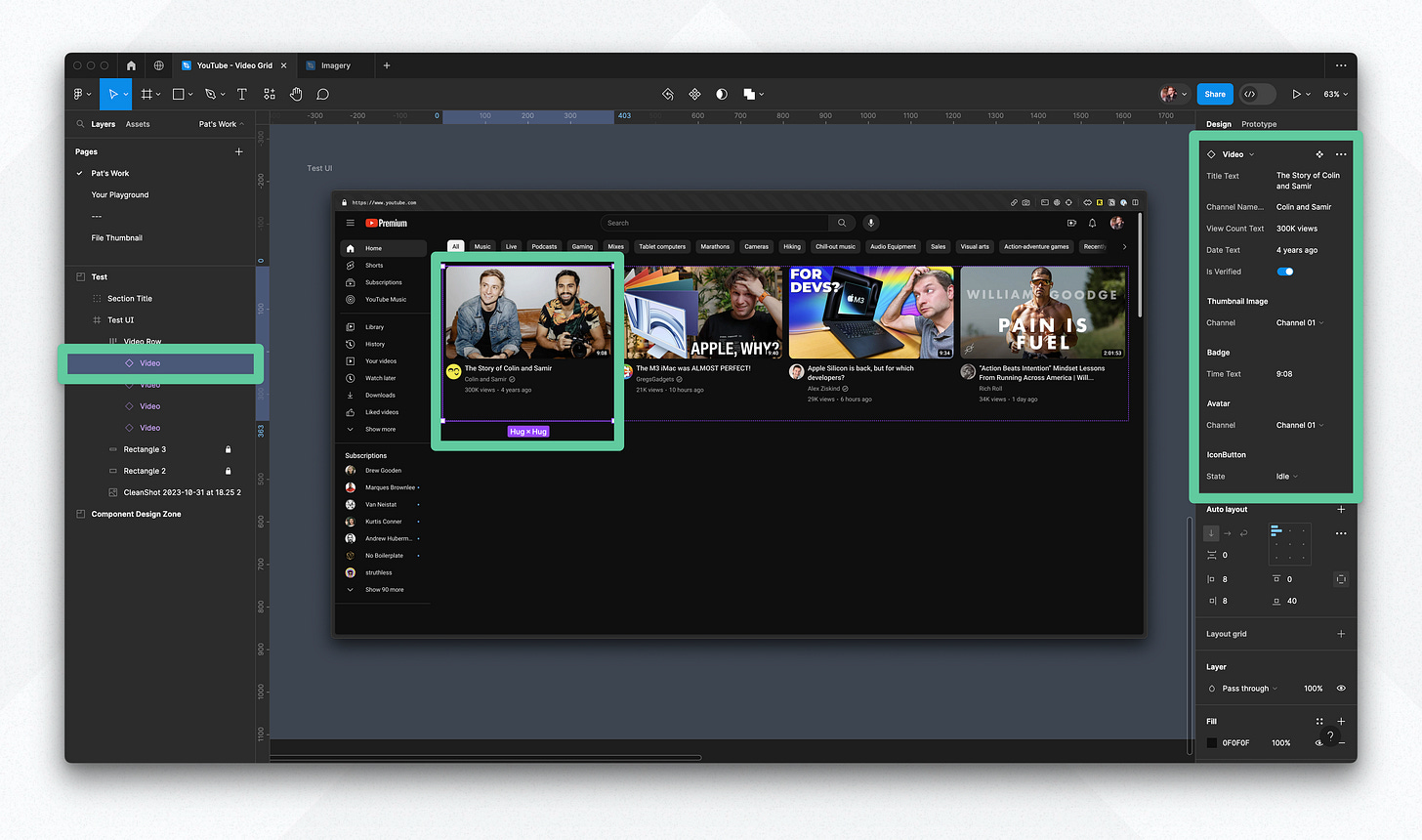
YouTube’s implementation of this pattern is highly interactive, incorporating a mini video player on hover with its own detailed set of controls. In order to keep this session a reasonable length, I chose to focus on designing only the elements necessary to capture the component in its idle state.
Video sections
1. Review in the browser, annotate the layout, and take notes
I start the session by reviewing the video component in the browser and discussing the elements that compose it. We take some notes and annotate the UI to give ourselves a better sense of the data and elements we’ll want to include when we start designing.
Timestamps:
2. Set up Video component basics & pull out subcomponents
In this section, we lay down the basics of the components we want for our design. We start with placeholder content to shape the general layout of the video component, then work through refining the styles to align with what’s applied to the real thing. Once the core of the video component takes shape, we abstract out a series of subcomponents to give our UI more flexibility for configuration.
Timestamps:

3. Test the instance in context & expose component properties
In the final section, we put the video component to use in context within the YouTube homepage layout. We test that the component repeats appropriately when forming a full row of videos and update our Video component to expose its properties and make the configuration of its instances more clear.
Timestamps:
37:20 - Exposing component properties
42:40 - Testing the component instances in context
47:22 - Conclusion
If you got a little value in this post, consider subscribing, sharing, or following me on Twitter. If you got a lot of value I’d appreciate it if you bought me a coffee 😎☕️.


