Hello! I’m Pat and Better by Design is my newsletter where I decode the DNA of good designs to inspire tomorrow’s classics. If you’re new here, join 1600+ product creators as we uncover new insights each week.

Product Design
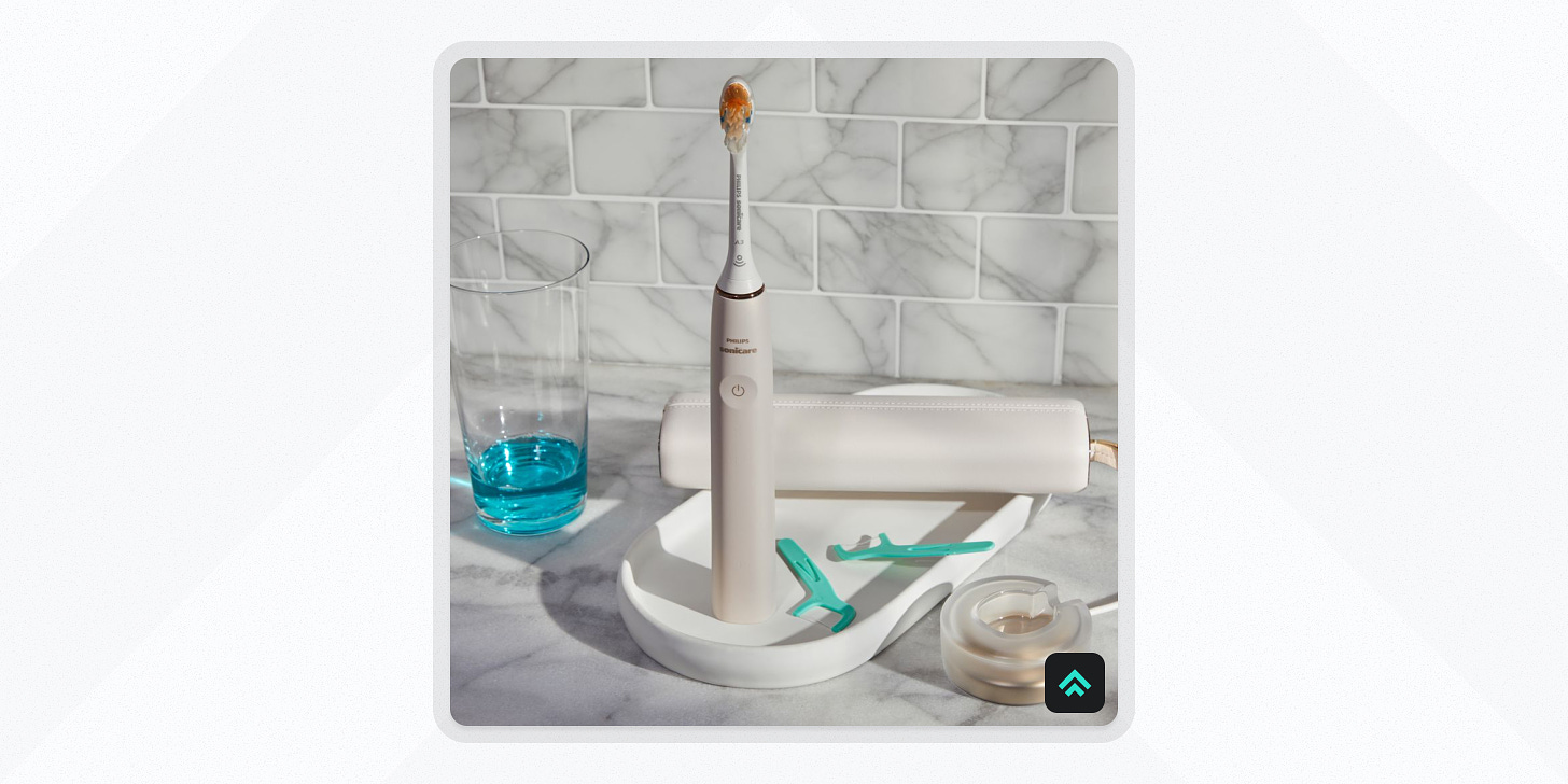
The Sonicare Toothbrush
If I could gift only one product to every one of you, it would be a Sonicare toothbrush (and since I can tell you’re thinking it… yes, I am the kind of person who would be excited to get nice socks for Christmas 🤓).
The Sonicare is an excellent personal care item designed to improve the toothbrushing experience. Born from the vision of David Giuliani, an entrepreneur, and his collaboration with two professors from the University of Washington, the Sonicare Toothbrush launched in 1992. Compared to the rest of the market, it stands out due to its use of sonic technology, which produces a dynamic cleaning action that drives fluid between teeth and along the gum line for better cleaning.
In my experience, the only downside to using one is that it cleans so much better than the alternatives that no other option will cut it after you adjust to the Sonicare.
Why’s it a good design? Let’s count the ways…
It’s Innovative
Sonicare's use of sonic technology was a novel and highly effective approach to oral hygiene. Offering thousands of brush strokes per minute, it provides a unique and unrivaled level of cleaning.
It’s Useful
If you’ve ever had a cavity drilled, you know how unpleasant the experience can be. So why put yourself in that situation?
The Sonicare Toothbrush excels in its primary function of cleaning teeth and promoting oral health. Every time I go to get my teeth cleaned the hygienist asks “You use a Sonicare, don’t you?” The difference is apparently that noticeable. So at least in my personal N of 1 study, the results have been great.
It’s understandable
I know, it’s a toothbrush, but still… the design nails the details to remove as much hesitation as possible for a user trying Sonicare’s unique technology for the first time.
The shape of the handle indicates how to hold it, the placement of the buttons makes it clear how to operate it, and visual indicators for battery life and brushing mode provide real-time feedback. Over the years, it’s also added smarter features such as timers for recommended brushing and pressure sensors to protect gums, furthering its understandability.
In sum
Innovative, useful, and understandable, the Sonicare Toothbrush showcases how good design can create standout experiences even from mundane tasks like brushing your teeth.

Brand Design
Porsche
Khe Hy and
recently had a great convo on Khe’s new podcast that at one point touched on Khe’s fascination with Porsche (which I very much share 😅).It reminded me of the classic Leo Burnett quote:
“Good advertising does not just circulate information. It penetrates the public mind with desires and belief.”
That fascination we’re feeling? It’s very much by design.
Decades of smart branding have compounded on top of an already stellar product, resulting in the kind of stranglehold on the public imagination that most companies can only dream of.
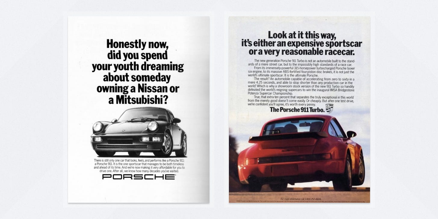
Some of the Porsche ads that best illustrate the company’s ability to stir the imagination come from an early 90s print campaign from Fallon (included above).
They’re simple with punchy, memorable headlines that grab your attention. The car itself is featured prominently which makes the ads inviting to look at without needing to include any other major visual elements. In the ad on the right, it uses the car in its red colorway to draw the attention of the eye even more. Finally, the small body copy is fun. The writers injected it with a personality that backs up the headlines and builds your idea of the kind of person who might purchase the vehicle.
That campaign is just one example of how Porsche’s excellent branding creates a mix of dreamy aspirations that makes so many people crave owning one. But to take Paul’s advice to Khe, maybe try renting first. 😇
Links to check out
The podcast → Why does work dominate our lives with Paul Millerd
Khe’s follow-up piece → Don't get the Porsche
My full breakdown of the 911 → Porsche 911: A dream in the shape of a sports car
Moment of Zen
Foureyes Furniture
I came upon Foureyes Furniture’s YouTube channel recently and was blown away by their level of craftsmanship. The video linked above is like a borderline ASMR experience for quality nerds like me 🤤.
As someone who works almost exclusively with digital media as materials, I’m always intrigued by the workflows of people crafting things in the physical world and love to discover the similarities and differences between our approaches to craft (despite my vicarious anxiety that they can’t Cmd+Z their way out of a mistake 🙃).
Give them a look!
If you got a little value from this post, consider subscribing, sharing, or following me on Twitter. If you got a lot of value, consider pledging to support my work with a paid subscription in the future.


