The Amazon "Smile" Logo
#23 - A walk-through of the 5 years of iterations that led to today's design
Hello! I’m Pat and Better by Design is my newsletter sharing pragmatic insights for creative innovation through the lens of design. If you’re new here, join our growing tribe of design innovators!
I love looking back at the evolution of brand identities.
Nailing a great one is deceptively hard and few companies get it right from the start.
In fact, many great brands took years of iteration to reach a result that finally crystallized in the public imagination.
Amazon is a useful example here as it took the company a solid 5 years to stick the landing with its logo.
Some things just take time.
Let’s check out the steps that paved the way for the Amazon logo we know today.
Phase 1 - The river phase
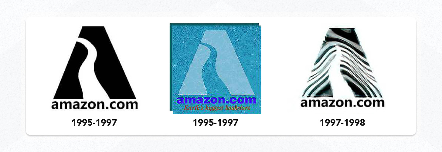
1995 - 1997 → In the original logo, the company ran with the Amazon River metaphor. The “.com” was front and center to make it clear this was a website and because… well… the dot-com bubble was in full effect. It wasn’t a bad start for a new company, but it did lead to some pretty literal and heinous design choices like overlaying it on top of a photo of water 🫠.
1997 - 1998 → The logo evolved to have zebra stripes… Not sure what the company was thinking here. Thankfully the choice was fleeting.
Phase 2 - The unsure wordmark phase
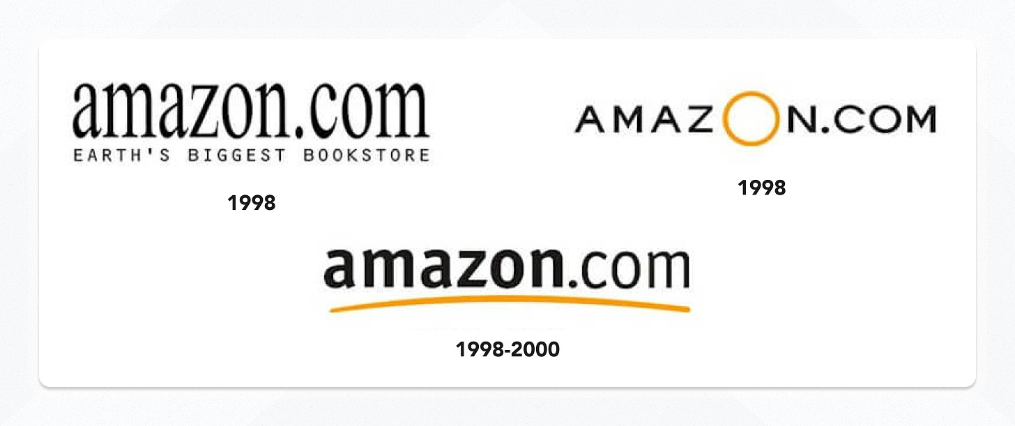
1998 v1 → Suddenly a hard pivot. The logo ditched the river metaphor and switched to a simple wordmark in a new serif font. I can imagine the brief from the marketing execs: “Focus on communicating ‘bookstore’!”. But this shift was quickly scrapped.
1998 v2 → Next, the logo dropped the bookstore tagline, shifted back to a sans serif font (this time in all caps), and introduced the primary orange brand color that persists to this day. An enlarged, colorful letter O took the focus as a new way to convey how much was contained within Amazon. However, again, this was short-lived.
1998 - 2000 → After these quick iterations, the logo reached a recognizable point where it stayed for a couple of years. It refined the typeface, made it bolder and more readable, and also put the brand color on a different element, this time opting for a downward arcing underline. A clear improvement over their previous marks.
Phase 3 - The “smile” phase
2000 - Present → Finally, the famous “Smile” logo designed by Turner Duckworth arrived. This iteration reached the stabilized form that we’re familiar with today. It dropped the “.com”, further refined the typeface, and inverted the branded underline to arc upwards to signal positivity (the “smile”). The designers chose to point that element from the letter A to the letter Z, hinting at how Amazon sold “everything from A to Z”. It could also be condensed to a single letter ‘A’, making the mark more scalable for the myriad of places the company needed to represent the brand.
Final thoughts
If you’re just starting a new project, don’t get too hung up on trying to lock down your “final” brand before making any other progress.
At this point, who even remembers the logos from Amazon’s first 5 years? Answer: only us... because we literally just looked at them.
So take a shot at something that feels good upfront, but expect evolution. Then keep experimenting until you find something that sticks, even if it takes years.
The last 1% of refinements that dialed in the “smile” logo were subtle but significant and set the foundation for a brand identity that’s as strong as ever more than two decades later.
Learn more
Links 🔗
AI Prompts ✨
What are the different types of logos and what are their advantages?
Discuss the relationship between a logo and a brand's identity.
Can you provide case studies of successful and unsuccessful logo redesigns?
If you got a little value from this post, consider subscribing, sharing, or following me on Twitter. If you got a lot of value, consider pledging to support my work with a paid subscription in the future.


I remember reading about the "A to Z" thing a couple of years ago and I've been unable to unsee it since! Kinda like the arrow using negative space in Fedex's logo