The Creative MBA #7
Cognitive bias vs. logical fallacy, respecting human vulnerabilities, permission marketing, and system status colors
You can’t depend on your eyes when your imagination is out of focus.
Intro
Welcome back to Better by Design. The only place on the internet where you’ll be asked to reflect on exploitations of logical fallacies and then dive into understanding UI status colors. If you haven’t subscribed yet, join 1100+ creative technologists by subscribing here:
Now, let’s get better…
Social & Behavioral Science
Cognitive bias vs. logical fallacy
While talking about cognitive bias has become more common in recent years I want to quickly talk about it alongside its close cousin, the logical fallacy. The main difference between the two is that cognitive bias reflects a natural part of our biology that we can’t change. To quote the article from Fallacy in Logic linked below:
Cognitive biases are our systematic inclinations towards certain patterns of erroneous thinking (or “irrationality”) when processing and interpreting information in the world around us. They are largely products of evolution to help us survive by simplifying information processing.
On the other hand, a logical fallacy is simply an error in reasoning or rhetoric that invalidates a claim. Again, to quote:
Logical fallacies are flaws in an argument that weaken the argument or make the conclusion invalid. These flaws, which may be committed deliberately or by accident, include drawing of false conclusions, distortion of an issue, an erroneous line of reasoning, misuse of evidence, or misuse of language.
It can sometimes be tricky to distinguish which you’re talking about because often a logical fallacy either results from a cognitive bias or consciously targets one. In either case, they represent our inherent vulnerabilities as rational creatures.
Takeaway
People who create products should be mindful of cognitive bias and logical fallacy as they influence both our own decision-making and the decision-making of our customers.
Practice
Think of a time when you’ve felt a product or company taking advantage of cognitive bias or logical fallacy to influence you.
How did you notice it? How did it feel? How did it change your behavior?
Think of a time when you’ve leaned into a cognitive bias or logical fallacy to support a product or design decision.
What did you intend to influence? What was the actual outcome?
Resources
Design Principles
Respect human vulnerabilities
“Respect human vulnerabilities” is the first principle of the Center for Humane Technology. I appreciate the work that Tristan Harris and his team are doing to educate us about the reality of how modern tech is used to influence us.
Cognitive bias is natural; it’s hardwired into our evolution. But we can’t afford to be naive about the role it plays in modern culture. The reality is that our cognitive biases are increasingly well understood and increasingly targeted to either influence us or directly manipulate our actions.
I’ve found that designers love to play the “I would never…” virtue card when it comes to conversations about exploiting cognitive bias. That’s fine. I know that you would never do it. But we need to accept the fact that there are many people (including many technology people, designers, or otherwise) who are actively exploiting them.
I believe this principle is particularly important for our work today and so I’ll cover it more in the months to come.
Resources
Business
Permission Marketing
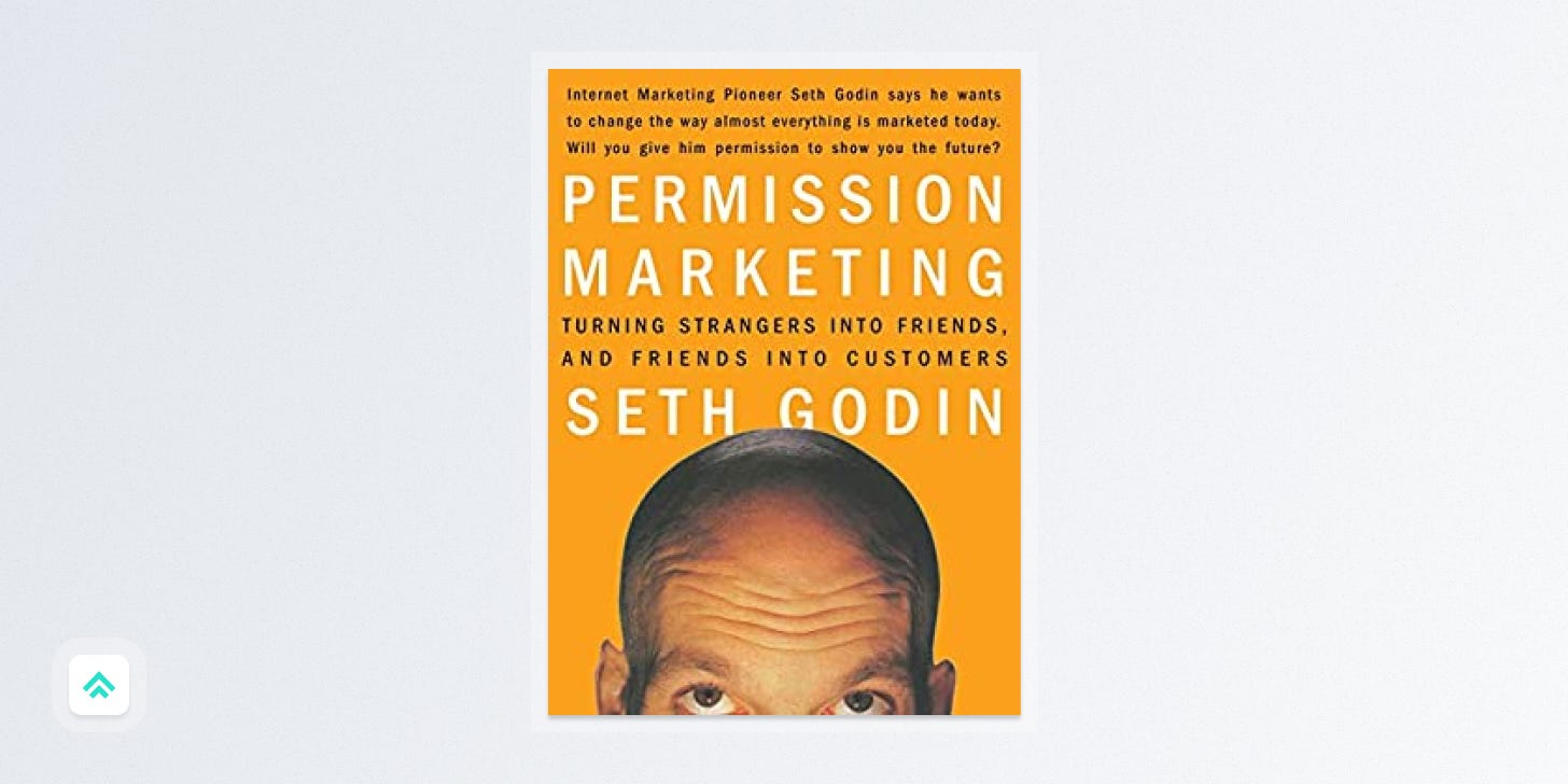
"Permission Marketing" is a somewhat self-explanatory but useful concept from Seth Godin’s 1999 book of the same name. In Seth’s own words:
Permission marketing is the privilege (not the right) of delivering anticipated, personal and relevant messages to people who actually want to get them.
In the book, Godin argues that traditional forms of advertising, such as TV commercials and print ads, are becoming less effective as consumers become savvier and are able to tune them out. Instead, he suggests that companies should focus on building relationships with potential customers first, earning their trust over time, and only then starting to share relevant offers.
In the meta twist of the day, this very newsletter is a form of permission marketing. You found it, gave it a chance, opted in, opened this message, and got here on your own. It’s my privilege to be able to deliver my work to your inbox each week and I have the utmost respect for that relationship. I admit that one day I will try to sell you things (I am trying to start a business after all). But they will be things that I think are relevant, high value, and worth your time. If you decide to buy them, great! But if not, that’s fine. I’m glad you’re here either way.
Resources
Technology
System Status Colors
We previously covered the importance of communicating system status for providing a good software user experience. Today we follow that up with one of the ways we implement and communicate that status: color. There are four categories of status that basically every software application accounts for: error, warning, success, and informational.
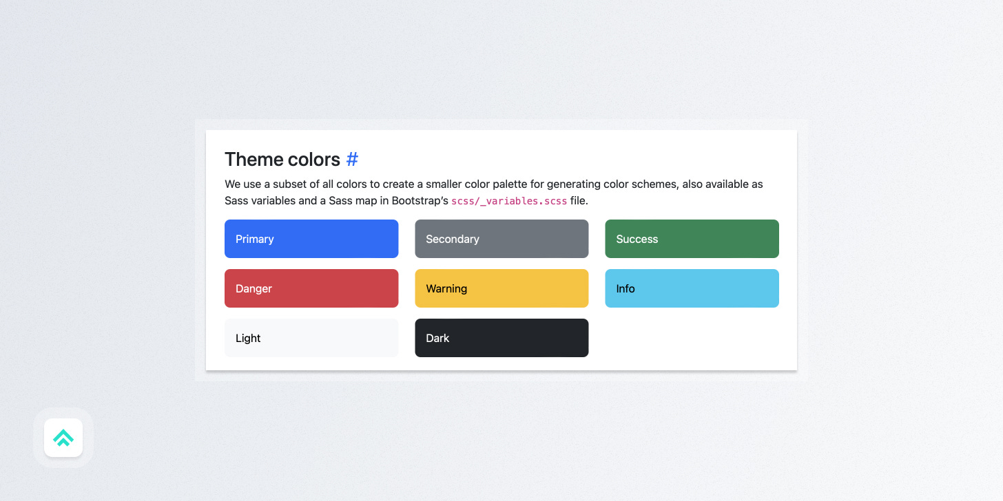
While I suppose you could make those whatever color you wanted, the common approach is to use stoplight colors, plus blue. So:
Error → Red
Warning → Yellow/Orange
Success → Green
Informational → Blue
Now, I don’t actually find system status colors that interesting. They just kinda are what they are. But what I do find interesting is how they influence how we build a product UI color palette around them.
Want to build a green-branded UI? That’s cool. But you also need to make sure to differentiate your primary brand green enough from the status green to be noticeable. You can notice that dynamic on display in the image from Bootstrap above: their primary blue is substantially different from their informational blue.
If you’re savvy and peeked at a primary color wheel, you probably noticed that the only color fully untouched by status is purple. In my totally unscientific gut feeling, this explains why there are so many purple branded apps: it’s easier to distinguish as a brand color in application UI that needs to protect status colors.
Resources
Craft

Do it just because it’s awesome
This is your friendly reminder that it’s okay to make something just because you think it’s awesome.
I feel like our push to create “data-driven” cultures within tech companies has led many people to get super hung up on trying to rationalize every single design decision.
I get it. I do it too.
But while there are plenty of moments when basing design decisions on hard data makes sense, there are also moments in design when the data can’t save you.
You have to use your taste and training and make a judgment call.
Will you choose the direction that’s kinda safe and blah?
Or will you choose the direction that excites you?
The choice is yours.
If you got a little value from this post, consider subscribing, sharing, or following me on Twitter. If you got a lot of value, consider pledging to support my work with a paid subscription in the future. Either way, I appreciate you!


