The design execution gap
Why it's hard to stick the landing with design execution and what we might do about it.
Here’s a catch-22:
Developers don’t want to own the UI design because they’d rather focus on programming but designers can’t own the design implementation because it’s too tightly coupled to complex front-end logic.
It’s no wonder a lot of companies can’t execute their design vision when the people who want to own the design execution can’t, and the people who do own it, would rather not.
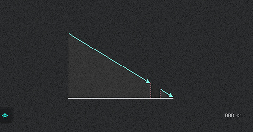
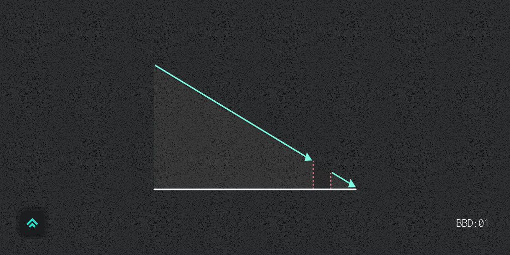
We’re stuck in what I call the “design execution gap”. A place where, despite everyone’s best intent, it’s hard to stick the landing in the last 10% of design execution.
So, where’s the gap coming from? And how might we address it?
The lessening design gap
The gap used to live more on the design side.
Design tooling simply couldn’t deliver a close approximation of web UI. Web designers were working with inherited tools meant to create static images for print and so every design was just a picture that developers had to interpret and build from scratch based on their eyes alone. It was impossible to work in a design “reality” that even came close to reflecting the reality of the code.
In 2014 when I started working at American Express we solved this problem by embedding UI developers into the product design team to enable us to prototype our designs in code. We’d then hand off that front-end prototype to the official dev team to integrate it into our broader production tech stack. This was my role on that team, actually. Compared to handing off static screens in Illustrator or InDesign this was a far better approach to capturing the team’s true design intent and lessening the execution gap.
But UI design tools have come a long way since that time. They’ve not only gotten generally better, but they’ve focused specifically on designing for the web. First it was integrating Sketch for UI design and testing the waters of some rudimentary re-usable elements. Then we added on a basic interaction layer with things like the Sketch + InVision combo (RIP InVision ☠️). Then finally we started putting the pieces together with tools like today’s dominant player, Figma.
Since adopting Figma I’ve been able to deliver designs that are much closer to the reality of the UI we intend to deliver. It’s still not perfect, but between my efforts to align design structure with code structure and Figma’s inspect functionality the developers on my team are now able to get a much more descriptive picture of the UI they’re meant to build.
The lingering dev gap
The bulk of the gap now is on the development side.
Compared with my Figma handoffs, there’s no good analog to help designers dig into the front-end code to ensure the design is being captured as intended. The front-end of the web has gotten so much more complex and abstract over the last ten years that it’s less accessible for non-developers to contribute to the implementation of the design. The layers of content, style and interactivity are so tightly bound to other logic that it’s at least impractical, if not impossible, for someone to safely contribute without routinely working in the codebase.
Even a designer who is okay with opening the web inspector is stuck. Sure, I can inspect the elements, but since the CSS classes are often generated and scrambled these days, just looking at the markup tells me little about how the interface is composed. It also makes it difficult to work through minor tweaks exclusively in the browser because many of the styles of like-elements are no longer technically shared via the cascade.
This is a problem for the last 10% of design execution. If we were working together in person it would be somewhat less of an issue because I could just sit next to my dev partner to pair on dialing in the details. But in the context of a remote, distributed team it tends to feel like a burden to continually request more and more fine tuning over Slack messages, Zoom invites and Github comments. So I either end up feeling like a pain in the ass or I let a few minor details slide. Not a great situation either way.
So it’s my opinion that we need to find a way to re-expose the stylistic portion of the front-end to the people who both deeply care about it and have the skills to fine tune it. But how?
A product isn’t the solution... yet
Perhaps your first instinct is to make another product to bridge this gap.
It’s not a bad idea, but I don’t think it’s our first step.
For websites (vs. apps) we do now have tools like Webflow which give designers more direct control over styling in a visual format that’s more accessible to them. This is a meaningful evolution, it just doesn’t meet my complex, web app use case yet.
At least for the apps that I work on the front-end architecture is sufficiently complex and unique on a company by company basis that I think it would be a challenge to design a product that’s both generic enough to cover all the variation and specific enough to add deep value to my existing workflow (not to mention warrant the expense on my team’s budget).
I’ve tried a number of tools over the years that have attempted to smooth out this middle ground between design and development but have never stuck with them. Why? Because sitting in the middle is awkward. It meant that the tools didn’t fully meet the needs of either designers or developers. They were just kinda okay, and “kinda okay” isn’t enough to merit the overhead of adding one more tool into the telephone game that is communicating and capturing design intent.
The first step
My instinct is that our first step is not to try solve this with a product, but rather with a cultural and architectural shift on the front-end to begin intentionally crafting a way to make the stylistic portion of the web more approachable for designers. Then, if we’re able to expose that portion of our apps in a standardized way that would in turn facilitate the ability for a product to come in and elevate that basic interface to another level of polished approachability.
To conclude, I want to pose a challenge to both designers and developers to help us move in this direction together:
As a designer, how might I level up my technical skill to share more ownership of the last 10% of design execution?
As a developer, how might I architect a more approachable and inclusive way to craft and maintain application styling?
Similar posts
If you got a little value in this post, consider subscribing, sharing, or following me on Twitter. If you got a lot of value I’d appreciate it if you bought me a coffee 😎☕️.


Loved this article/call-out. So legit. There is a Chrome plugin called "VisBug" that a very talented developer I used to work with (and who now works at Google) created to try to help bridge this gap. I haven't used it in a professional setting, only have played around with it. Maybe worth a look? idk. It could be a thing.... Another thought: this makes the role of "UX Engineer" so important and needed. You NEED at least one hyper-UI-minded front-end dev on the product team to own the implementation of the UI and to ensure proper compliance with any existing design system. It makes me want to expand my code knowledge and transition from designer to UX Engineer on the product team since this role is so greatly needed and honestly seems like a satisfying role to have at this point in time.