The MAYA design sweet spot
Finding the 'most advanced yet acceptable' design for product success
Intro
Hello friends 👋 We’re back!
I took a summer holiday up the east coast of the US the last couple weeks and wow, did it feel good to step away from my computer! Highly recommend it! 😎
If you’ve been a subscriber for a bit, thanks for sticking around while I took that breather. And if you’re new here, thanks for joining while I was taking a break! Score one point for the magic of the internet right there.
I listened to a ton of podcasts, audiobooks and music during my hours on the road and today I wanted to highlight one particular concept that strongly resonated with me: the MAYA principle of design from Raymond Loewy.
The MAYA principle
In his book “Hit Makers” journalist Derek Thompson highlights the work of famed industrial designer Raymond Loewy and his concept of the MAYA design (“most advanced yet acceptable”). Thompson writes “Loewy believed that consumers are torn between a curiosity about new things and a fear of anything too new.”
Or in Loewy’s own words:
“The adult public’s taste is not necessarily ready to accept the logical solutions to their requirements if the solution implies too vast a departure from what they have been conditioned into accepting as the norm.”
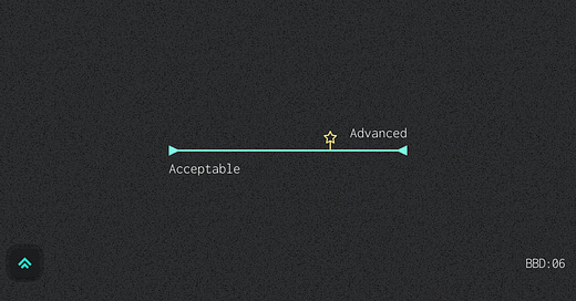
The MAYA design sits in the middle between solutions that are entirely novel and those that are entirely familiar: be too novel and customers will tune you out, but be too familiar and customers will look right past you. MAYA is the sweet spot. Novel, but familiar. Advanced, yet acceptable.
It’s the designer’s job to align the balance of novelty and familiarity to customers’ tastes in the time that they’re working in. It’s our job to find the sweet spot.
Two quick MAYA examples
It’s easy to start seeing MAYA in designs once you have the language for it. I’ll give two examples to help you start finding your own (which is more fun anyway).
Let’s start with a MAYA success: the iPhone.
At its core the iPhone was a deep technological advancement. It was a dramatic departure from traditional mobile telecommunications. So how did Apple make this advanced technology familiar and acceptable?
You might start by considering the decision to simply call the device the iPhone. Despite the device being an all-purpose mobile computer, Apple opted to frame the device as a cell phone. This gave consumers a familiar mental model to understand the new technology and start to imagine how it might fit into their daily lives.
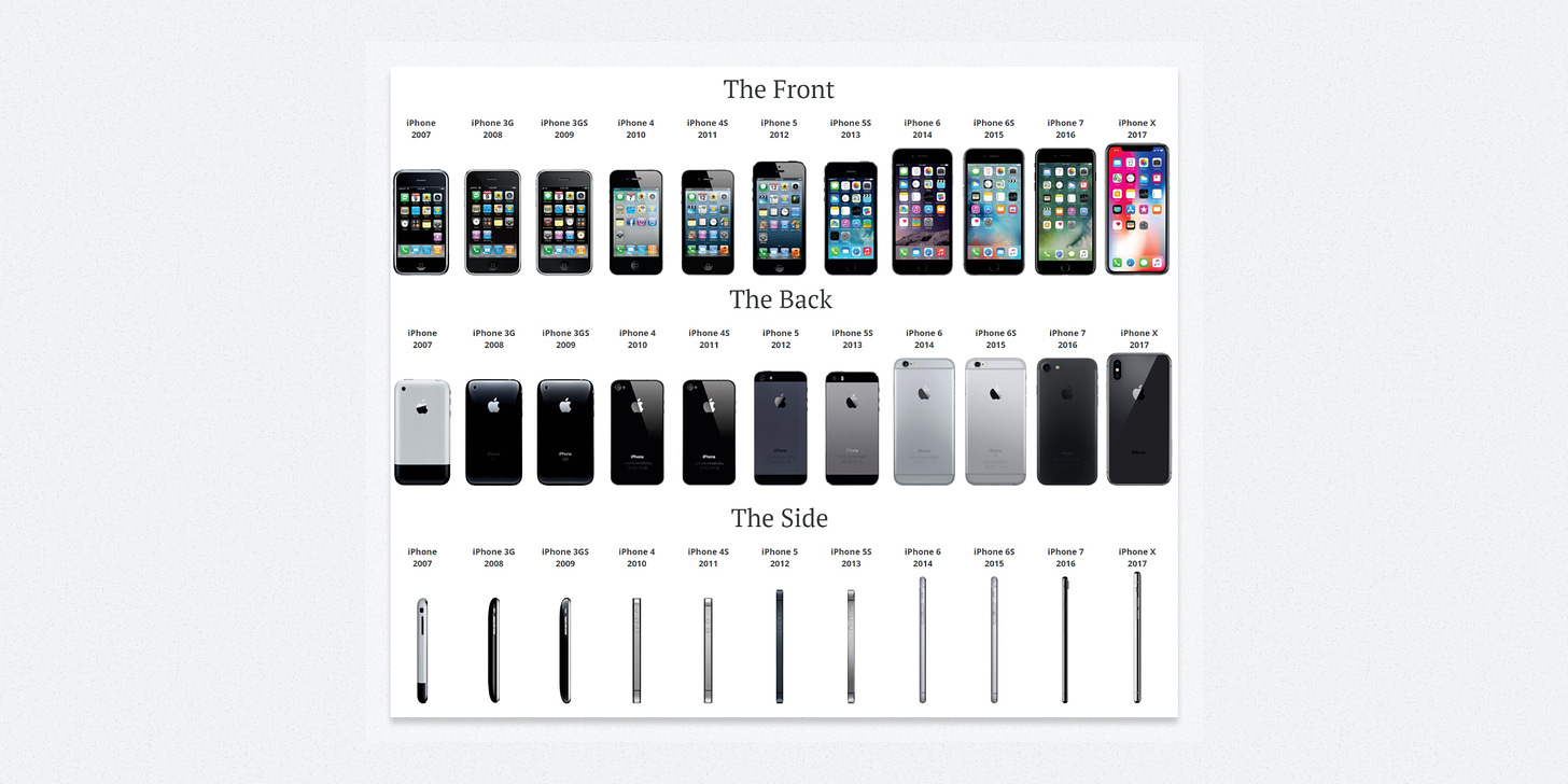
A couple of the more dramatic shocks to the MAYA balance of the iPhone were the removal of the home button (on the hardware side) and the move away from skeuomorphism in iOS 7 (on the software side). Regardless of how you feel about those two design choices, they reflected intentional moments in time where Apple recognized they had reached sufficient familiarity with their technology to make a larger design departure to advance the form.
Otherwise, if you chart the design evolution of the iPhone you see a lot of stability from generation to generation. It’s very iterative and very familiar over its fifteen years of life. Apple only gradually ‘advances’ the design, carefully introducing changes so as to not upset the MAYA balance.
Now for a MAYA failure: Google Glass.
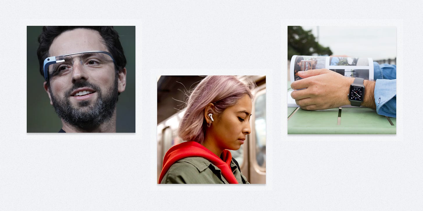
Google Glass was one of the most hyped forays into wearable technology back in 2014. In retrospect, the project was very advanced but nowhere close to acceptable. Like it may have actually been decades ahead of its time in terms of general consumer sentiment. We’re now close to ten years down the road without much meaningful movement in terms of day-to-day, wearable, visual augmented reality.
So while consumers looked past Google Glass, what wearables did they gravitate towards? For the most part, watches and headphones. Design executions that were reinterpretations of other familiar pieces of tech that felt much less invasive to most people’s daily modes of living. Things like the Apple Watch and Airpods were perhaps less advanced than Google Glass, but much more acceptable and so the market rewarded them. They were the advancements that people were ready for at that moment in time.
It seems likely that some kind of augmented reality glasses will eventually find the MAYA sweet spot, but only after years of gradual consumer acclimation via more approachable forms of wearable tech.
How I’m Approaching MAYA at JupiterOne
JupiterOne already had robust functionality when I joined the company. Its struggle was a perception that it wasn’t “easy to use”. JupiterOne excelled at the advanced and failed at the acceptable. Its core data graph and query language were powerful but still new for most security customers.
The product was very innovative, but too novel.
JupiterOne’s user interface doubled down on that novelty by diverging from many common UI patterns that might help a customer orient themselves in this new landscape.
I aimed our design approach at moving JupiterOne towards its MAYA sweet spot; make the platform more familiar via its UI to offset the novelty of its core technology. This meant leaning into common, robust UI patterns from other web applications. It meant aligning navigation patterns with what customers expect from other tools in our space. It meant making color an intentional enhancement rather than a novel distraction. And so on…
This quote from Derek Thompson’s article nicely sums up my approach:
“To sell something surprising, make it familiar; and to sell something familiar, make it surprising.”
At this moment in its life, JupiterOne’s technology is surprising which means that we need our interface to help make it familiar. We haven’t stopped innovating, we just now recognize that we must dress our innovation in familiar clothing to make it approachable for the nascent market we’re playing in. Over time, as the core tech becomes more familiar we’ll earn the right to push more design boundaries and incorporate more surprise and customers will be glad to come along for the ride.
Activating design based on MAYA
Activating design based on MAYA boils down to two things:
Answering this question honestly: is the core of your product more familiar? Or is it more surprising?
Using design to shift the force in the opposite direction until you find a balance.
If you come down on the side of being surprising, you might invoke familiarity by relying on common patterns, limiting major overhauls and changing the design gradually over time. On the other hand if you come down on the side of being familiar you might encourage surprise by doing things like exploring a bolder visual style or increasing levels of abstraction in the product.
It’s important to remember that neither direction is right or wrong.
Surprising isn’t “good”. Familiar isn’t “bad”. And vice versa.
They just are what they are. Equal and opposite forces, like the design equivalent of Newton’s third law of motion.
Our job is to find their natural balance, to encourage their equilibrium, and tend to the homeostasis of their inherent tension.
Do that and you’re well on your way to hitting the MAYA sweet spot.
Related topics
A few other topics I was thinking about while writing this week. Particularly focused on consumer preferences and cognitive biases that influence them.
Stated preference (what we say we want) vs. revealed preference (what we reveal we want via our actions)
Cognitive biases
“Happens when the familiar is favored over novel places, people, or things.”
“A preference for the maintenance of one's current or previous state of affairs, or a preference to not undertake any action to change this current or previous state.”
“A fallacy in which one prematurely claims that an idea or proposal is correct or superior, exclusively because it is new and modern.”
“People tend to develop a preference for things merely because they are familiar with them.”
“Travelers will estimate the time taken to traverse routes differently depending on their familiarity with the route. Frequently traveled routes are assessed as taking a shorter time than unfamiliar routes.”
Links of the week
A couple fun things I got value out of this week
Van Neistat - The Value of Mentorship
Van Neistat offers up a rare combination of incredible creativity, technical mastery and deeply useful insights on being a creative person.
As a new maker of things, it's easy to slide into convincing yourself you need shiny, new tools to do better work. But as you gain mastery, that slide lessens. Most tools will do, within a reasonable range of quality.
Derek Thompson - The four letter code to sell just about anything
The article that inspired the book that inspired this post (so meta… 🤯)
Not Just Bikes - Stroads are Ugly, Expensive, and Dangerous (and they're everywhere)
As it turns out, the design of modern American transit (and in turn cities) is ridiculous and mostly awful. Not Just Bikes gave me words to describe the ridiculousness, like “Stroad” (a terrible word for a terrible thing 🤣)
Similar posts
If you got a little value in this post, consider subscribing, sharing or following me on Twitter. If you got a lot of value I’d appreciate it if you bought me a coffee 😎☕️.


Great post! I've worked in developer tools most of my career and this resonates with me, a UI that uses familiar concepts goes a long way, even if the data behind it is complex. A couple jobs ago, I was working on distributed tracing, I remember participating in several design sprints for a new feature where we were trying to visualize complex statistical findings. We tried tree visualizations and other fancy stuff. It all tested poorly (and would have been harder to build). In the end we just went with a sorted list that had more information on demand explaining the sorting order. It turns out that even power users don't want novel UI patterns.
The stroads video... oh man. I lived in Sweden for 2 years after growing up in a US town with lots and lots of stroads. I never thought about it growing up, but now I can't unsee the stroads all around me here, as well as the general unpleasantness of needing a car to do simple errands.