The Enduring Power of the MAYA Rule
Finding balance in the endless quest for breakthrough design
Welcome to Unknown Arts, where builders navigate AI's new possibilities. Ready to explore uncharted territory? Join the journey!
Design is too important to be left to designers.
Intro
Since I shared my first thoughts on Raymond Loewy’s MAYA rule last year, the principle has only grown in my mind. I’ve read and written many thousands of words about creativity and design in the months that have passed and as they’ve come and gone, I’ve noticed a pattern: I keep uncovering principles that hinge on the keystone of finding balance.
For Aristotle, it was the balance between the extremes of excess and asceticism, for Taoists, it’s the balance between exerting effort and letting go, and for Loewy it was the balance between the advanced and the acceptable. Let’s dig in!
The MAYA rule
In his book “Hit Makers” journalist Derek Thompson highlights the work of famed industrial designer Raymond Loewy and his concept of the MAYA design (“most advanced yet acceptable”). Thompson writes “Loewy believed that consumers are torn between a curiosity about new things and a fear of anything too new.” Or in Loewy’s own words:
“The adult public’s taste is not necessarily ready to accept the logical solutions to their requirements if the solution implies too vast a departure from what they have been conditioned into accepting as the norm.”
The MAYA rule dictates that the ideal design sits in the middle between solutions that are entirely novel and those that are entirely familiar; be too novel and customers will tune you out, but be too familiar and customers will look right past you. MAYA is the sweet spot: novel, but familiar, advanced, yet acceptable.
As product creators, it’s our job to align the balance of novelty and familiarity with customers’ tastes. It’s our job to find the sweet spot.
Three quick MAYA examples
It’s easy to begin seeing MAYA in designs once you have the language for it. I’ll start you out with three examples and then you can go and find your own (which is more fun anyway 🤓).
A MAYA success: the iPhone
At its core, the iPhone was a deep technological advancement and a dramatic departure from traditional mobile telecommunications. So how did Apple make this advanced technology familiar and acceptable?
To start, they simply named the device the iPhone. Despite the tech being an all-purpose mobile computer, Apple opted to frame it as a cell phone which gave consumers a familiar mental model to understand the new technology and to imagine how it might fit into their daily lives.
If you chart the evolution of the iPhone you see a lot of stability from generation to generation. It’s very iterative and familiar over its sixteen years of life because Apple is careful to advance the design gradually so as to not upset the MAYA balance.
That being said, Apple still injects bigger changes on a somewhat routine basis. A couple of the more dramatic shocks to the MAYA balance of the iPhone were the removal of the home button (on the hardware side) and the move away from skeuomorphism in iOS 7 (on the software side). Regardless of how you feel about those two design choices, they reflected intentional moments when Apple recognized they had reached sufficient familiarity with their technology to make a larger design departure to advance the form.
A MAYA failure: Google Glass
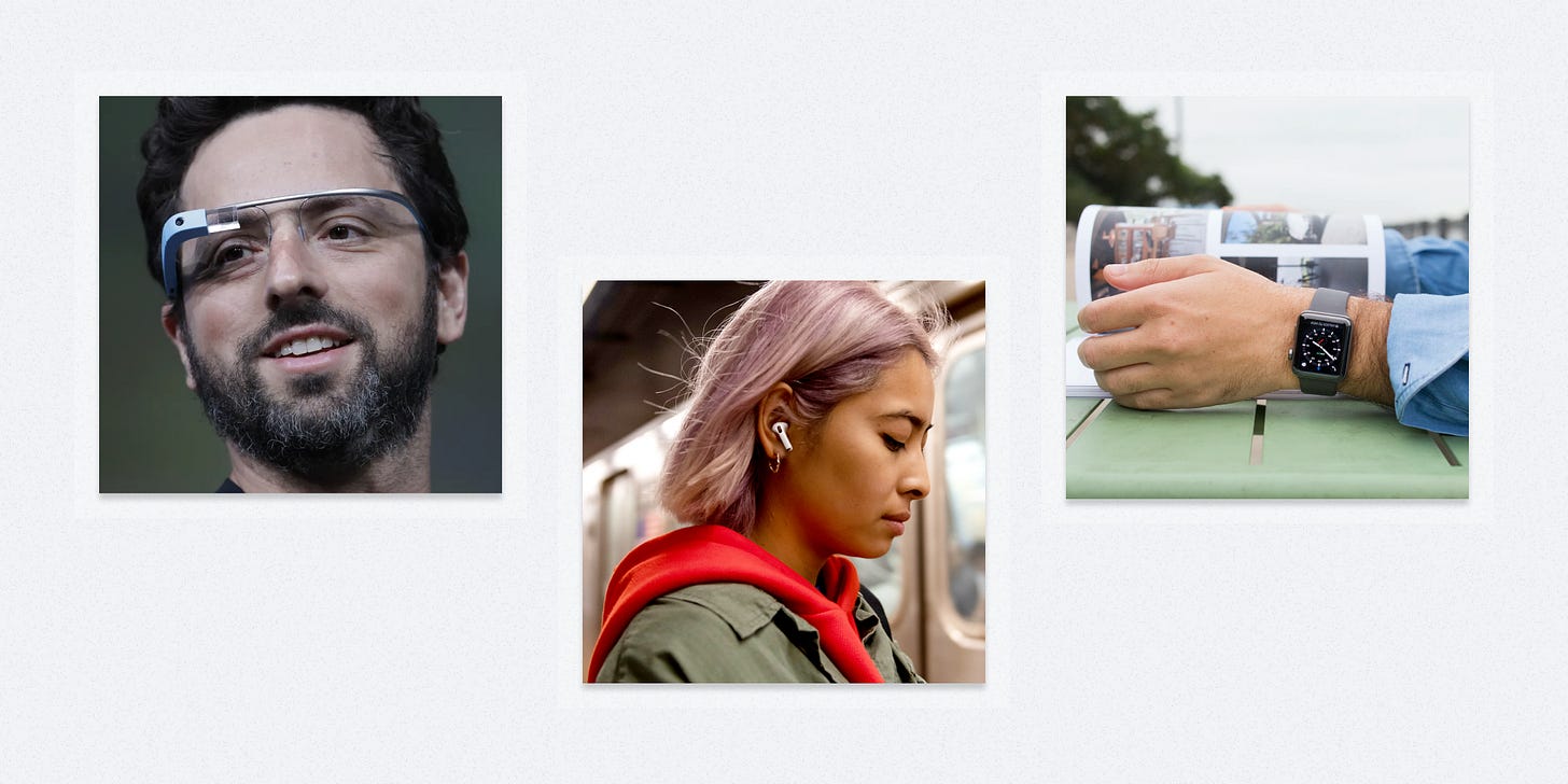
Google Glass was one of the most hyped forays into wearable technology back in 2014. In retrospect, the project was very advanced but nowhere close to acceptable. It may have actually been decades ahead of its time in terms of general consumer sentiment. We’re now close to ten years down the road without much meaningful movement in terms of day-to-day, wearable, visual augmented reality.
So while consumers looked past Google Glass, what wearables did they gravitate to? For the most part, watches and headphones. These design executions were reinterpretations of other familiar pieces of tech that felt much less invasive to most people’s daily modes of living. Things like the Apple Watch and AirPods were perhaps less advanced than Google Glass, but much more acceptable and so the market rewarded them. They were the advancements the people were ready for.
It seems likely that some kind of augmented reality glasses will eventually find the MAYA sweet spot, but only after years of gradual consumer acclimation via more approachable forms of wearable tech.
A recent MAYA breakthrough: ChatGPT
Recently, we witnessed the popular breakthrough of generative AI via the explosion of interest in OpenAI’s ChatGPT tool.
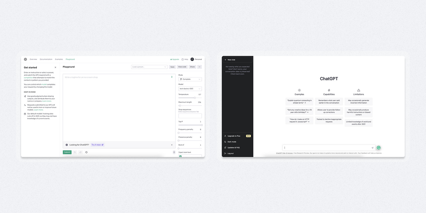
What I find fascinating about this breakthrough is that much of ChatGPT’s core tech had been open to the public since 2020 via other interfaces (like Open AI’s API Playground), and yet it didn’t resonate in the same way.
Then a few seemingly minor tweaks later, ChatGPT explodes. Why? Two related product choices stand out to me:
The design choice to pivot the interface to a conversational chat style which was more familiar to more people
The technical choice to feed the context of the chat thread to the model with each prompt in order to create the illusion that it understood the flow of the conversation
In the bigger picture of the creation of large language models, those choices seem minuscule. However, together they were enough to nudge text-centric generative AI from advanced BUT NOT acceptable to advanced AND acceptable. They shifted the MAYA balance, hit the sweet spot, and in doing so vaulted us into a whole new era of computing.
How I’m approaching MAYA in my work
The core of JupiterOne was already robust when I joined the company. Its struggle was a perception that it wasn’t “easy to use”. The product excelled at the advanced and failed at the acceptable.
J1’s data graph and query language (J1QL) are powerful but represent a new experience for many potential customers. Learning a programming language is a tall order under any circumstance but doubly so when you’re trying to get meaningful results from the ever-changing digital footprint of modern, cloud environments.
So we asked ourselves a couple of simple questions:
How might we move JupiterOne toward its MAYA sweet spot?
How might we make the platform more familiar via its UI to offset the novelty of its core technology?
The video above represents one answer to that question. In order to make our query language and data model more approachable, we created a visual interface to browse possible graph items and build syntactically correct queries to return them. It’s still very much an MVP in that its functionality doesn’t yet match the depths of what you can achieve via the raw query language, but it does represent a step forward in unlocking the product’s innovation for a wider audience. It’s a solution that starts to tilt the MAYA scale back in the company’s favor.
Activating design based on MAYA
“To sell something surprising, make it familiar; and to sell something familiar, make it surprising.” - Derek Thompson
Activating design based on MAYA boils down to two things:
Answering this question honestly: is the core of your product more familiar? Or is it more surprising?
Using design to shift the force in the opposite direction until you find a balance.
If you come down on the side of being surprising, you might invoke familiarity by incorporating more common patterns. On the other hand, if you come down on the side of being familiar you might encourage surprise by doing something like exploring a bolder visual style.
It’s important to remember that neither direction is right nor wrong.
Surprising isn’t “good”. Familiar isn’t “bad”. And vice versa.
They just are what they are. Equal and opposite forces, like the design equivalent of Newton’s third law of motion.
Our job is to find their natural balance, encourage their equilibrium, and tend to the homeostasis of their inherent tension.
Do that and you’re well on your way to hitting the MAYA sweet spot.
Until Next Time,
Patrick
Interested in working together? Check out my portfolio.


